Common Color Palettes Used in the Garment Industry
Color is more than just a visual element in fashion — it’s the soul of every garment. In the apparel industry, colors help define a brand’s personality, shape customer perception, and spark emotional connections. Whether it’s a vibrant red that conveys energy, or a calm blue that reflects trust, color choices can turn simple designs into powerful statements.
To ensure consistency and creativity, fashion designers and garment factories rely on standardized color palettes. From CMYK and Pantone systems to real fabric swatches, these tools make it possible to control color accuracy from design to production. Understanding these palettes is essential for anyone working in fashion.
Types of Color Palettes Commonly Used in the Garment Industry
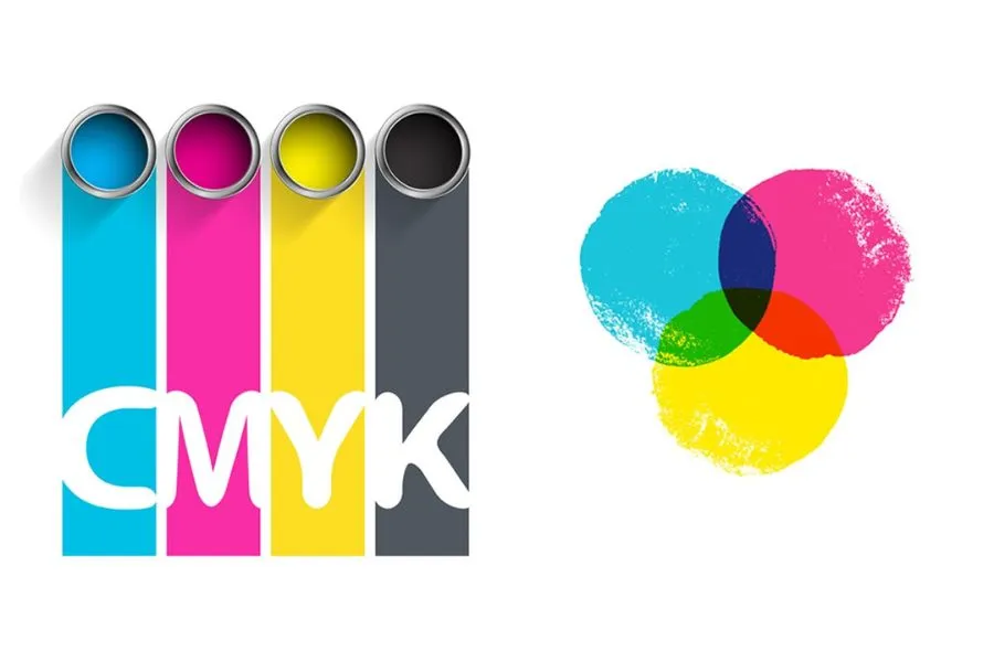
1. CMYK Color Palette (Cyan – Magenta – Yellow – Black)
In printing on fabric—especially for patterns, logos, or complex images—the CMYK color model is the international standard. It allows the combination of four basic colors to create thousands of shades, enabling designers to reproduce images almost exactly when printing onto fabric.

- Application: Standard for heat transfer, digital printing, and fabric pattern printing.
- Role: Mixing basic colors to generate complex shades and logos.
- Note: Best suited for printing; for large-scale dyeing, systems like Pantone are often more precise.
2. Pantone Color Chart (PMS)
When absolute consistency and precision are required for global production, Pantone is the most widely used system. Each color has a standard code, helping the entire supply chain—from Vietnam to Europe—to “speak the same color language.”
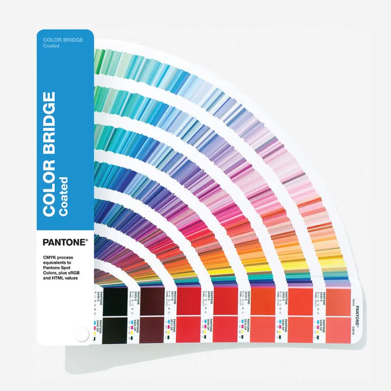
- Application: Internationally standardized system for global brands.
- Advantage: Easy to communicate codes and ensures absolute color precision across different factories.
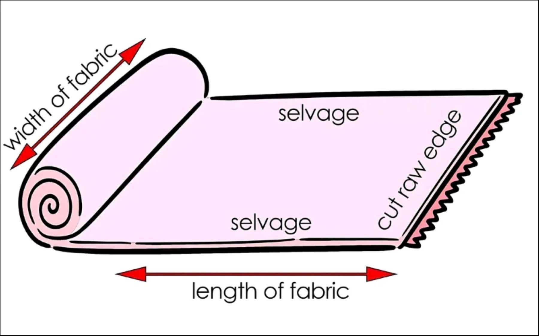
3. Fabric Swatch / Color Cards
Nothing is more intuitive than seeing and touching the color on actual fabric. Fabric swatch cards are collections of dyed fabric pieces, essential for choosing colors for uniforms and interior fabrics to reduce the risk of mismatch.

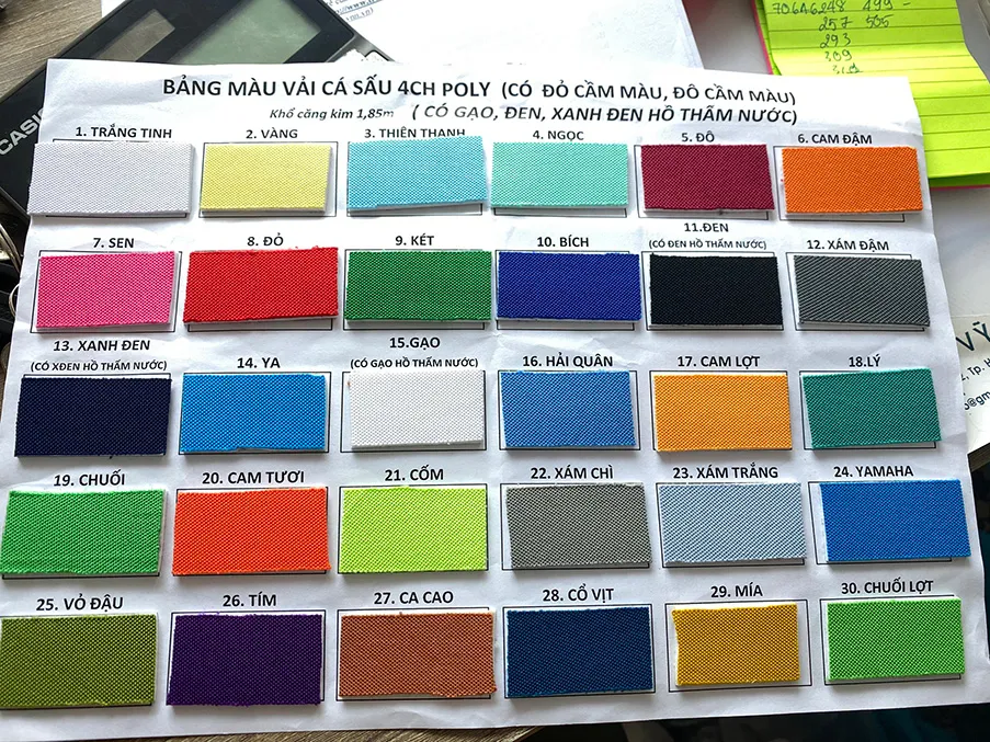
- Characteristic: Reflects the true color, texture, and light reflection of the dyed material.
- Advantage: Minimizes risks of color deviation in mass production, especially for large uniform orders.
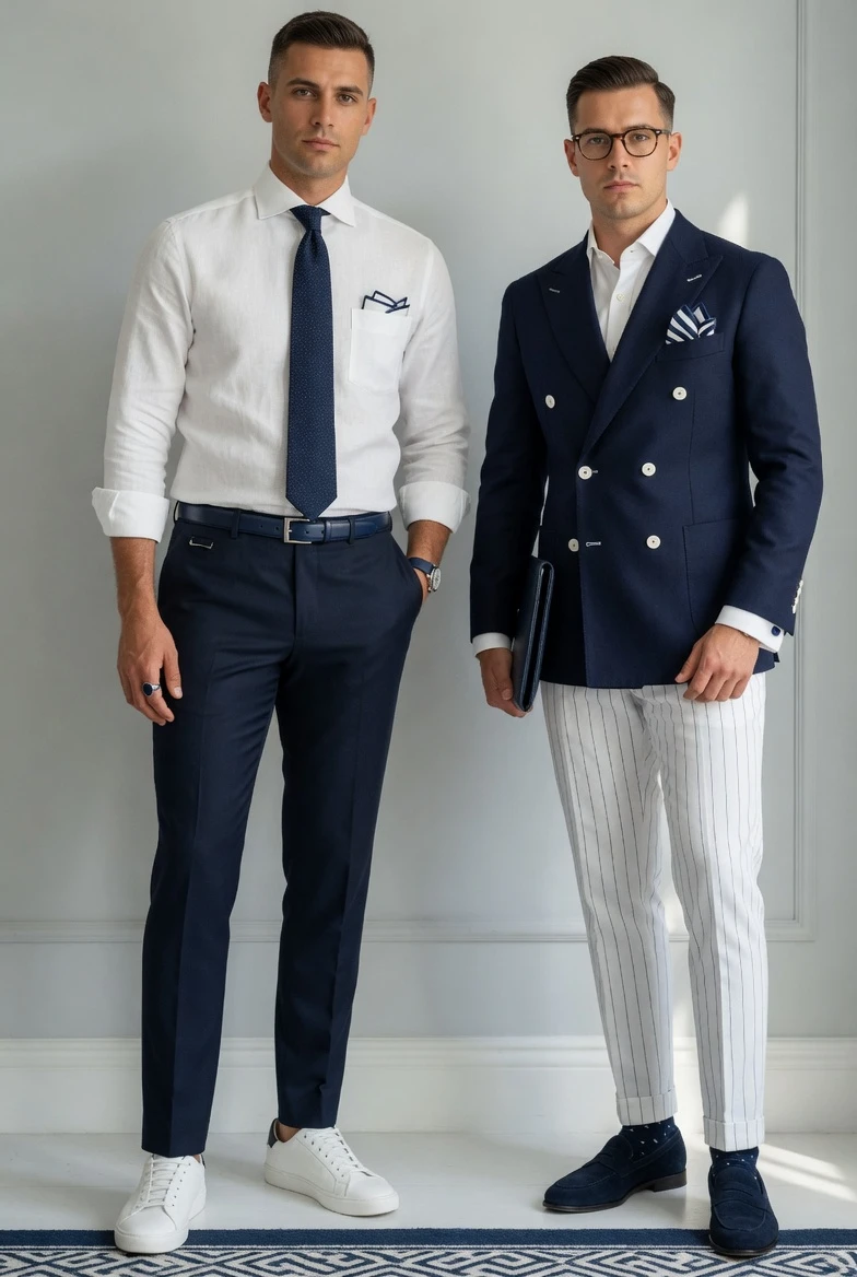
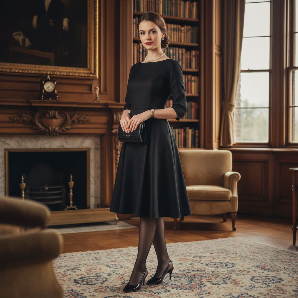
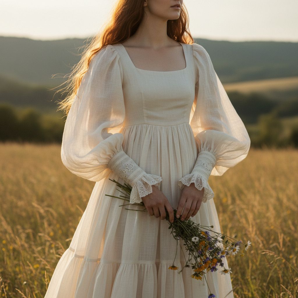
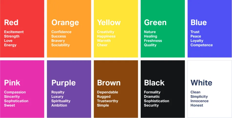
4. Color Palettes Based on Meaning and Psychology
Colors are “emotional languages” in fashion. Choosing colors based on symbolic meaning allows garments to convey brand personality or evoke specific customer emotions.
| Color | Meaning / Impression |
|---|---|
| Red | Passionate, strong, dynamic |
| Black | Elegant, powerful, mysterious |
| White | Pure, pristine, minimalist |
| Blue | Trust, calmness, professionalism |
| Yellow | Optimism, positive energy |
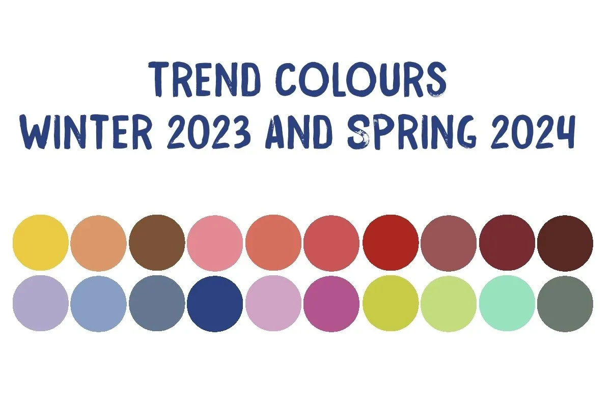
5. Trend Color Palettes
In fashion, colors change with the seasons. Trend palettes from organizations like Pantone Color Institute or WGSN help brands catch consumer tastes and deliver collections that match current preferences.
Conclusion
Color in the garment industry is a key strategy influencing production techniques and brand image. Applying the right palette—from CMYK to Pantone—ensures garments achieve high accuracy and professional consistency. At Mekong Garment, we utilize these indispensable tools to turn your creative vision into perfect physical products.