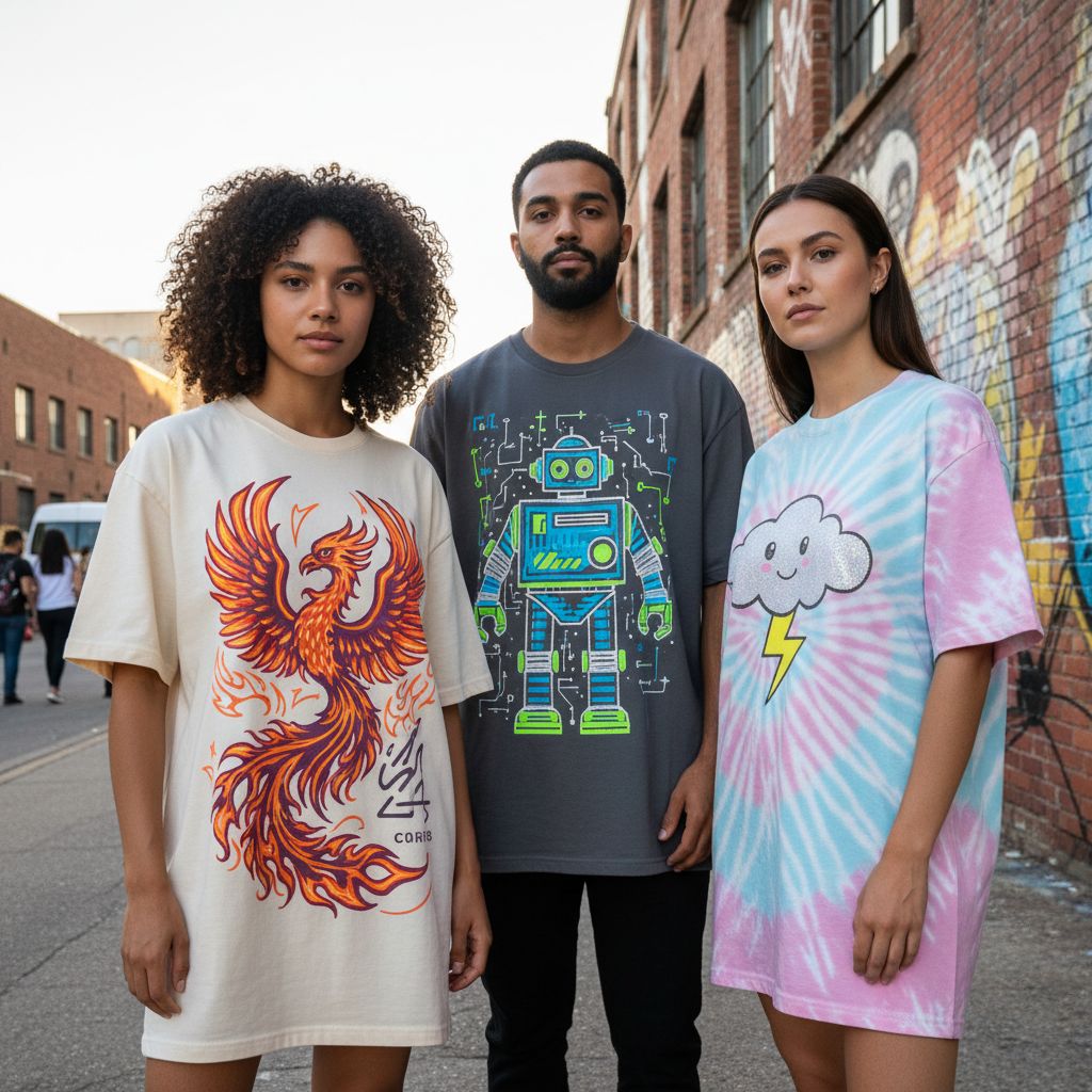
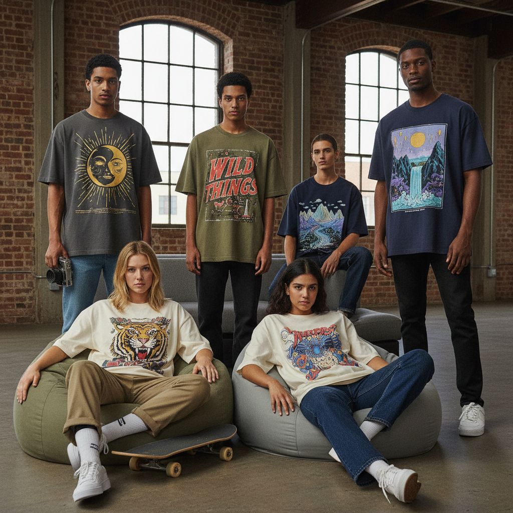
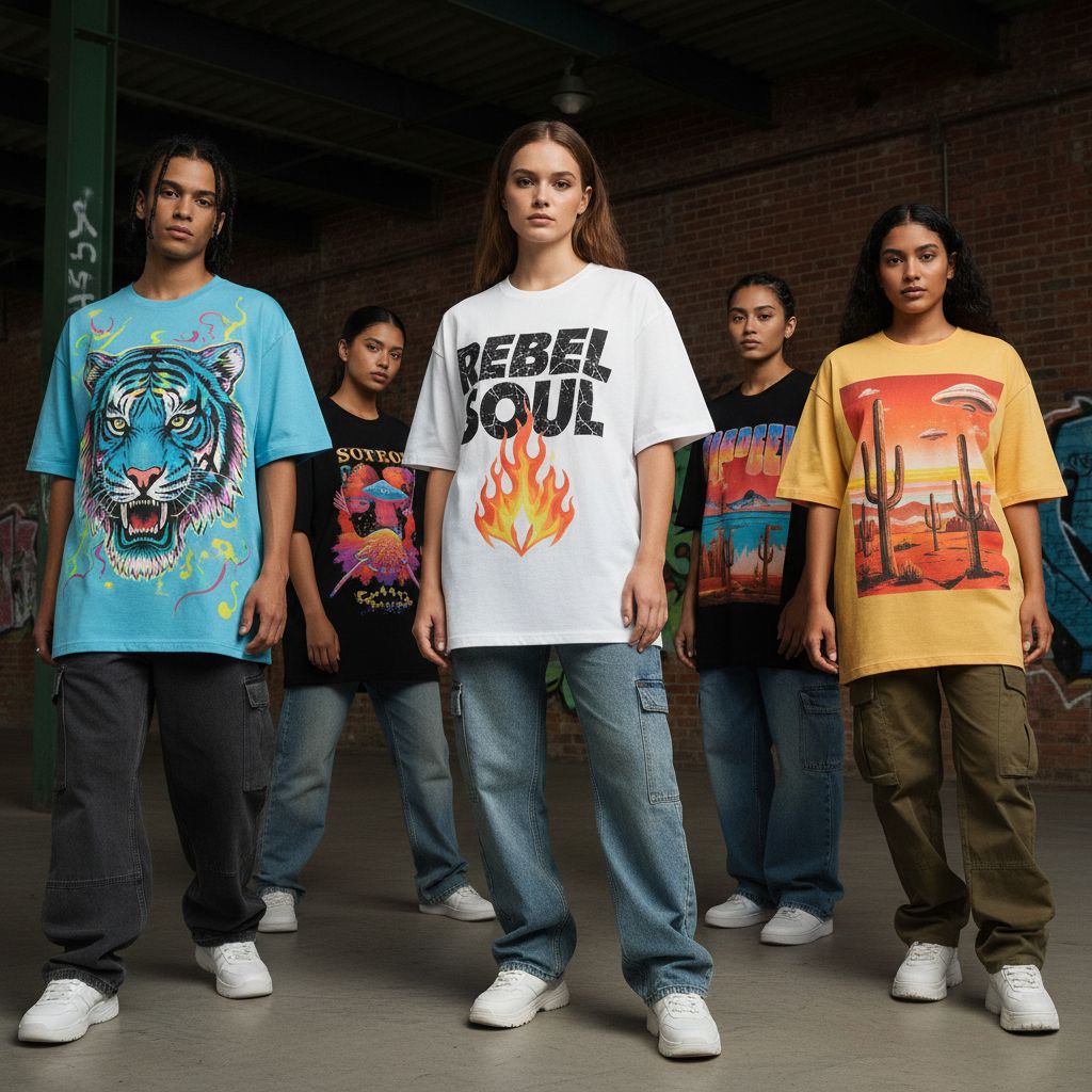
Oversized screen-printed tees are a streetwear staple, defined by their boxy shape, dropped shoulders, and bold graphic energy. However, combining oversized silhouettes with screen printing is easy to mess up. This guide provides 5 Dos and Don’ts across fit, fabric, ink, and placement to ensure your oversized graphic tee looks intentional, feels comfortable, and maintains its quality after washing.
=> Related Article: T Shirts Manufacturing Vietnam | Mekong Garment Factory
Why Oversized Screen-Printed Tees Are Tricky
Unlike standard tees, oversized garments hang and fold more dynamically. This means graphics can warp or disappear into fabric folds if not scaled correctly. Furthermore, large, heavy prints on a wide body can make the shirt feel stiff and hot. Success requires more than just scaling up a regular design; it requires a strategic approach to silhouette and ink deposit.
1) DO Balance Print Scale & DON’T Overwhelm the Silhouette
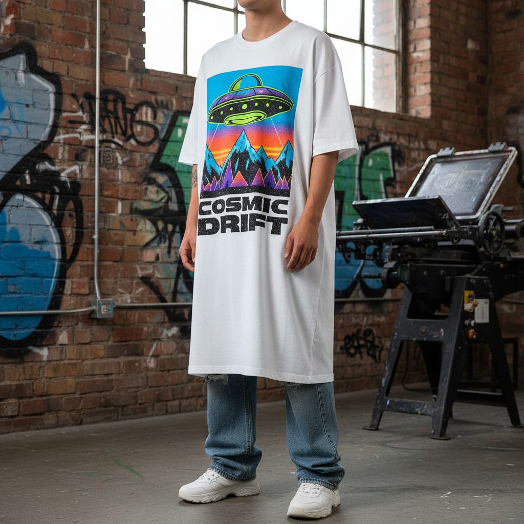
Your print should guide the eye—not fight the shirt. A medium-to-large front print with clean margins usually works better than a “poster-style” print that covers the entire front. If your graphic touches seams or looks cramped when worn, it’s a sign that the scaling is off.
2) DO Optimize Ink Feel & DON’T Create “Plastic Armor”
Oversized tees must move naturally. Thick, heavy plastisol ink kills the drape of the fabric. Consider softer ink options like water-based or discharge prints for a “soft hand” feel. Note: Large solid areas of heavy ink can cause the shirt to crack faster and feel uncomfortably hot against the skin.
3) DO Match Fabric Weight & DON’T Use Flimsy Materials
Oversized silhouettes look best with structured fabrics. A 220–280 GSM cotton provides the premium streetwear feel and stability needed for large graphics. Compact knit cotton ensures cleaner print results and prevents the neckline or shoulders from collapsing after a few washes.


4) DO Design for Movement & DON’T Trust Flat Mockups
An oversized tee folds and shifts when worn. A centered graphic that looks perfect on a flat mockup can appear too low on a real body. Placement tip: Aim for slightly higher front placements to compensate for the longer body length and natural fabric drape. Wear-testing is the only real way to ensure quality control.
5) DO Control Visual Hierarchy & DON’T Over-Stack Elements
A strong oversized design relies on negative space to feel premium. Avoid cluttering the canvas with too many fonts or slogans. This doesn’t mean you can’t be bold, but your shirt needs a clear visual concept. Minimal elements often carry a much higher perceived value in the streetwear market.
Conclusion
Oversized screen-printed tees look their best when the fabric weight, ink choice, and graphic scale work in harmony. Prioritize structure and soft hand-feel to create a garment that is both stylish and durable. If you need help with your print design or material selection, focus on these five principles to ensure a professional, retail-ready result.