Over time, research shows that the colors you wear and surround yourself with can shift your mood and shape how others respond to you. This post explains the physiological responses to color, explores cultural differences, and provides practical tips for applying color intentionally in your daily life.
Why Color Has an Emotional Impact
Color psychology studies how different hues influence human behavior and perception. These effects occur through multiple pathways, from direct physiological triggers to learned social cues. For instance, red is often linked to increased heart rate and vigilance, while cool tones like blue and green support focus and calmness.

The Three Core Pathways:
- Visual Stimulation: Saturated, bright colors energize the brain, while muted tones promote tranquility.
- Learned Associations: Cultural meanings (e.g., “Red = Danger” or “Green = Nature”) deeply affect our subconscious responses.
- Social Signaling: The colors you choose to wear send immediate non-verbal cues to everyone you interact with.
How Colour Can Influence Your Mood
Your emotional state often shifts in response to hue and saturation. Use these patterns to tailor your environment or wardrobe to the energy you want to evoke:
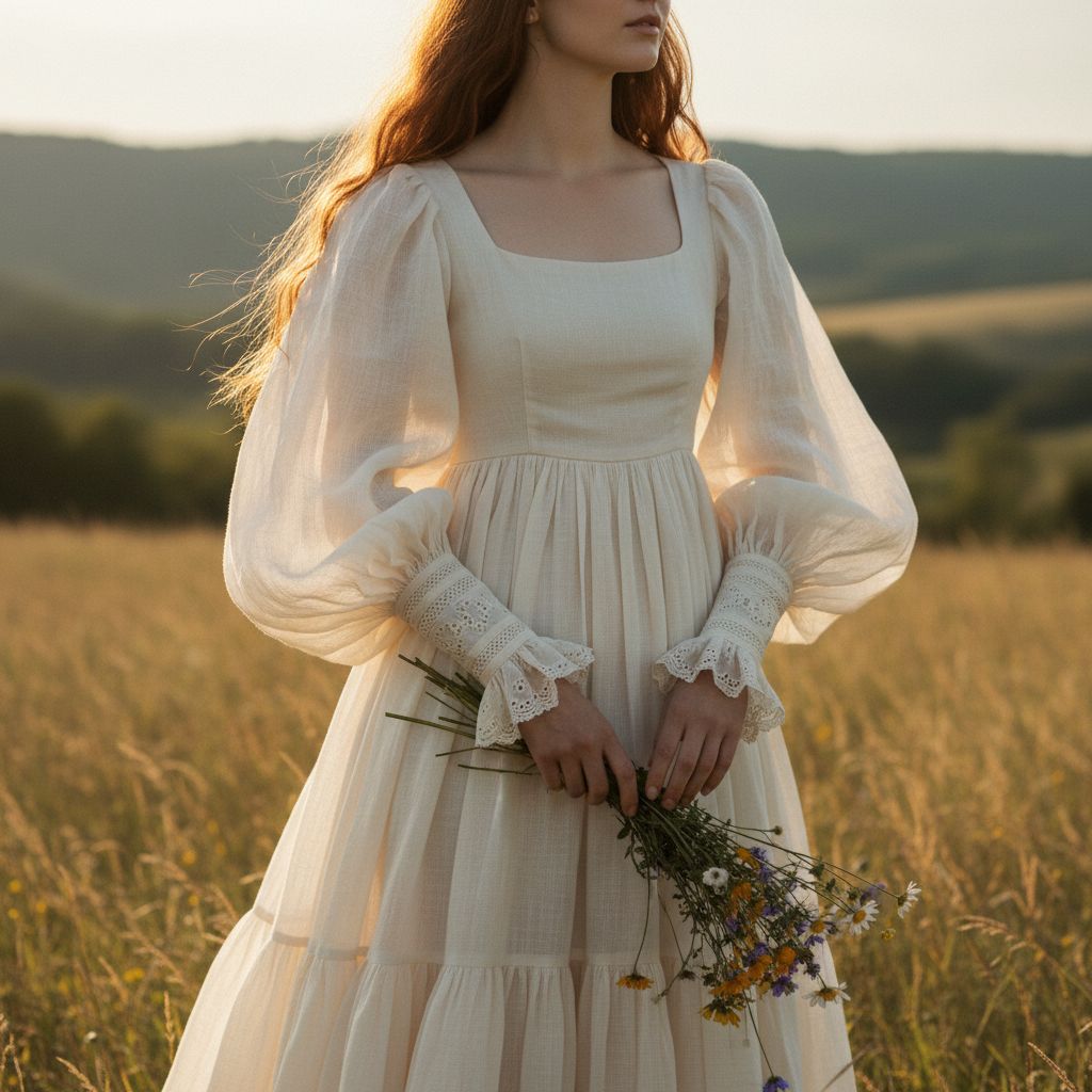
- Warm, Bright Colours (Red, Yellow): These activate and energize. A bright yellow accent on a sluggish morning can provide a mental lift.
- Cool or Muted Colours (Blue, Green): These soothe the nervous system. Exposure to green has been shown to lower blood pressure and perceived stress.
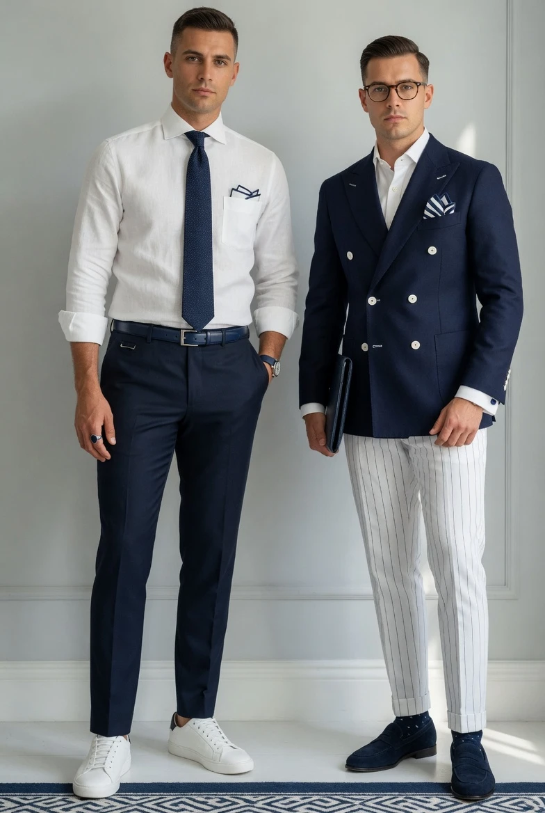
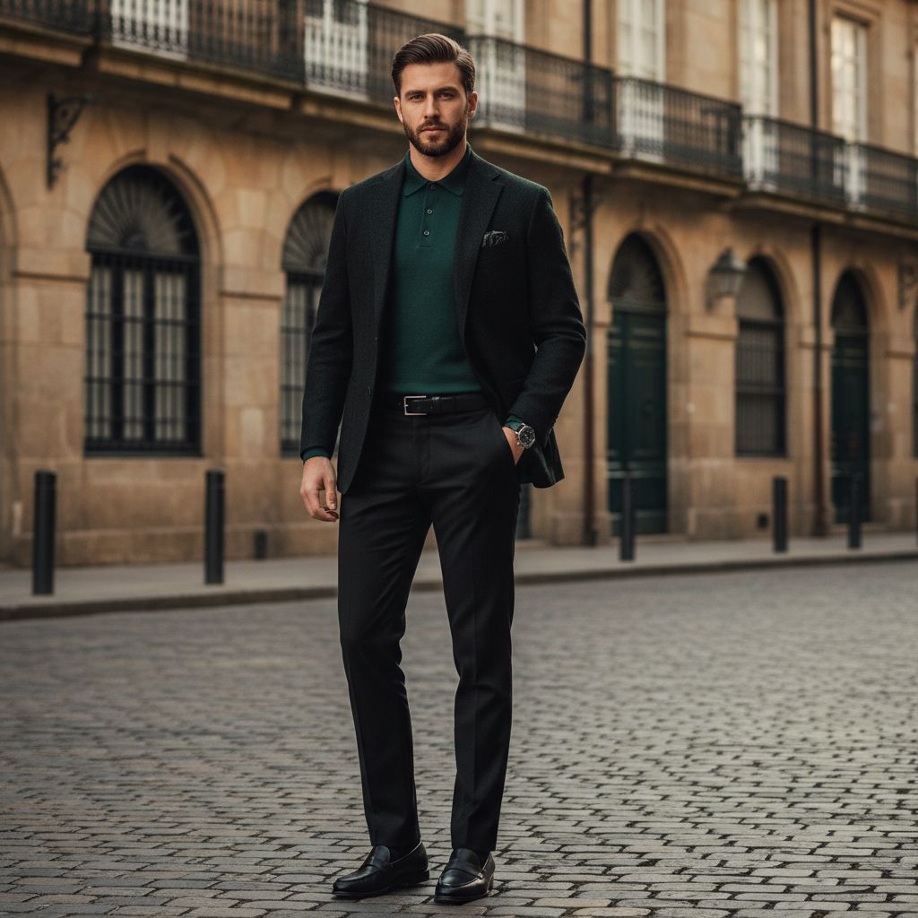
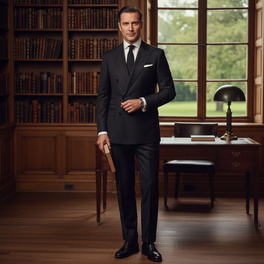
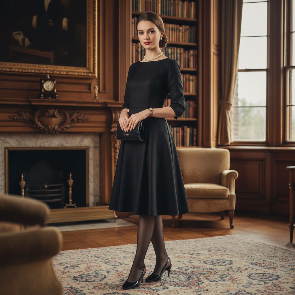
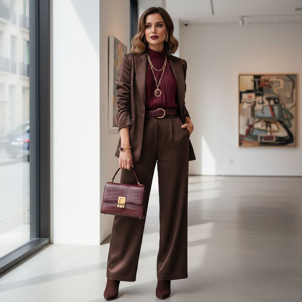
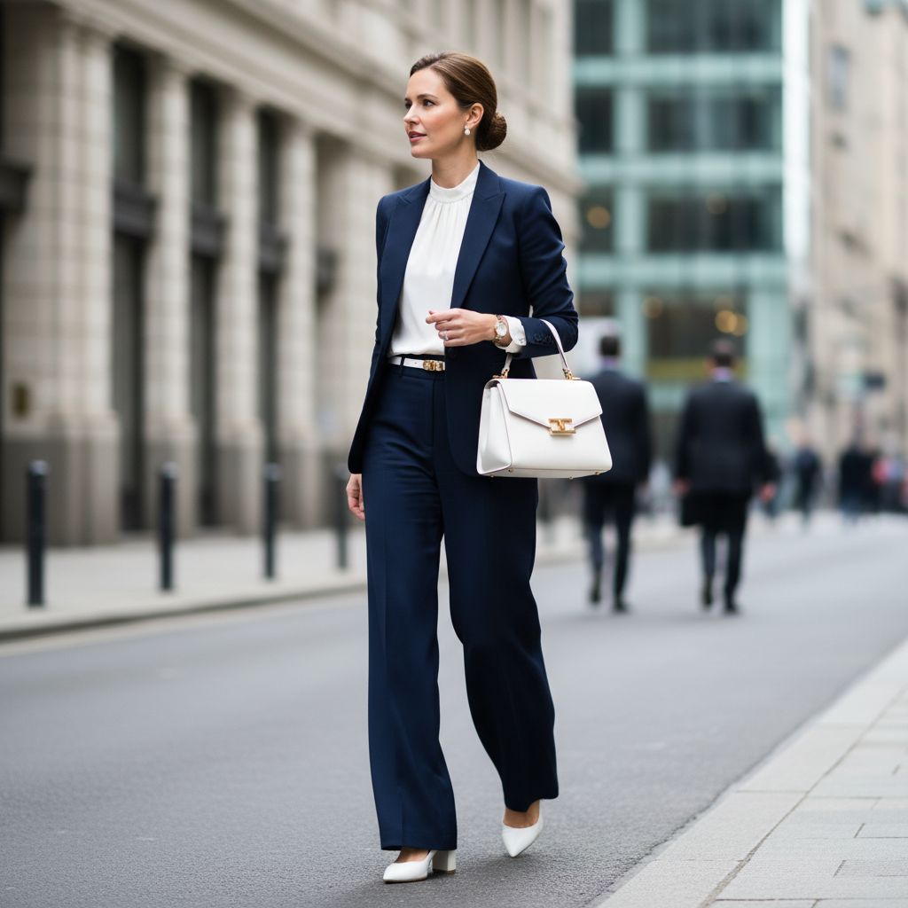
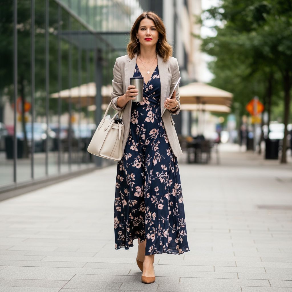
- Deep Neutrals (Navy, Charcoal, Taupe): These provide a sense of stability and control—ideal for high-stakes professional settings.
How Colour Shapes Social Response
Visual cues, including color, influence approximately 90% of snap judgments made about people. Mastering these cues can help you navigate social and professional environments with more confidence:
- Attention and Attraction: The “Red Dress Effect” suggests that wearing red can boost perceived dominance or attractiveness.
- Professionalism: Deep neutral tones signal competence and reliability, allowing your skills and personality to take center stage.
- Personal Branding: Small colored accessories (scarves, ties) are smart tools to change your visual signal without overwhelming your look.
Practical Guide: Using Colour Intentionally
To maintain balance in fashion or interiors, consider the 60/30/10 rule: 60% neutral base, 30% secondary tones, and 10% bold accents.

| Goal | Colour Strategy | Why It Works |
|---|---|---|
| Energetic & Alert | Bright red or yellow accents. | Warm tones raise arousal and attention. |
| Calm & Composed | Cool blues, sage greens, or pastels. | Lower saturation regulates mood signals. |
| Trustworthy | Navy, charcoal, or deep taupe. | Signals consistency and professionalism. |
| Reset Focus | Switch from bright to muted tones. | Reduces visual “noise” and over-stimulation. |
Conclusion
Color is a powerful yet subtle tool. While it doesn’t replace authenticity and preparation, it can significantly influence how you feel and how others perceive your presence. At Mekong Garment, we help brands select the perfect color palettes that align with their identity and the emotional response they wish to create. Think purposefully, start with small touches, and choose colors that genuinely make you feel empowered.
FAQs: How Color Affects Mood and Perception
Can color really affect my mood or how others respond to me?
Yes. Color influences emotion and perception through visual stimulation (brightness and saturation), learned cultural associations (e.g., red for attention, green for nature), and social signalling (what you wear communicates intent and status). Effects are real but moderate and depend on context, individual differences, lighting, and garment style.
What does research say about color and mood?
Studies show patterns highly saturated, warm colors often increase energy and arousal; cool, muted tones tend to calm. Findings vary by method and population, so results are not absolute. Personal experience, past associations, and situation often shape whether a color lifts or dampens your mood.
How does color change how other people respond to me at work or social events?
Color acts as a nonverbal cue. Dark neutrals (navy, charcoal) often signal professionalism and competence; blues convey trust and approachability; reds attract attention and can signal confidence or dominance; softer tones and pastels suggest friendliness and approachability. Combine color with fit, grooming, and behavior for intended effects.
Are color meanings the same across cultures and individuals?
No. Many associations are learned and culturally specific white is bridal in some cultures, mourning in others. Personal history, age, and taste also shift reactions. Test choices in your cultural and social context rather than relying on universal rules.
How should I choose colors to influence mood or responses intentionally?
Start with your goal (energize, calm, command attention, appear approachable). Use saturation and value to match the effect: brighter and warmer for energy, muted and cool for calm. Anchor outfits in neutral bases (black, navy, beige) and add accent colors to guide perception. Try garments in different lights and get feedback from trusted colleagues or friends.
Can using color incorrectly backfire?

Yes. Overly bright or clashing colors can distract or overwhelm; colors that conflict with cultural expectations can send the wrong message; low contrast can reduce visibility of details. Also, color alone cannot compensate for poor fit, unprofessional behavior, or lack of preparation.