Typography can make a shirt feel pro or feel cheap fast. And here’s the trap: a font that looks great on your laptop can look muddy, broken, or unreadable once ink hits fabric. So this guide does two things:
- Gives you 10 Canva fonts that usually print well on tees
- Tells you how to use them so they still look good in real life
Before The Font List: 5 rules that save your design
Before jumping into the font list, it helps to lock in a few print-safe rules. Fonts don’t live on a clean white screen they live on fabric texture, ink spread, distance reading, and movement. That’s why a “good-looking” font can still fail on a t-shirt if the strokes are too thin, the spacing is too tight, or the message is too small. These five rules act like a quick filter. Follow them, and almost any design instantly looks cleaner, reads better, and survives real-world printing without nasty surprises.
- 1) Design for 6–10 feet away: If someone can’t read it from a few steps away, it won’t sell. Quick test: zoom out until the design is about the size of a phone screen. Still clear? Good.
- 2) Avoid thin strokes (unless you print big): Thin lines can fade or break, especially with screen printing.
- 3) Keep it to 1–2 fonts: More fonts usually looks like a school poster, not streetwear.
- 4) Watch tight spacing: Letters that are too close can “fill in” after printing.
- 5) Match the font to the vibe: Don’t force it. A cute script for a tough gym shirt will feel wrong.
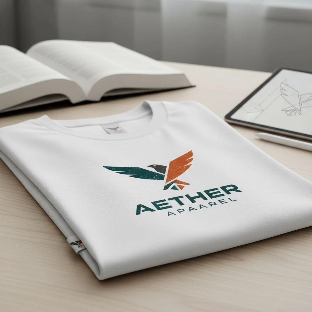
The 10 Best Canva Fonts for T-Shirts Designs
Typography can make a t-shirt feel premium or feel cheap even if the artwork stays the same. A font that looks sharp on your screen might print blurry, lose detail, or become hard to read once it’s on fabric. That’s why the best t-shirt fonts aren’t just “pretty” they’re clear, bold enough to hold ink, and readable from a few steps away. You’ll find 10 Canva fonts that usually hold up well on t-shirts, plus quick notes on what each one is best for, when it looks its best, and what to avoid so your final print looks as good as your mockup.
1) Montserrat (Clean + modern)
- Best for: minimal tees, brand names, clean slogans
- Why it works: simple shapes, easy to read
- Use it like this: Pick Bold / SemiBold for chest prints. Add a bit of spacing for all-caps text
- Avoid: super thin weights on rough fabric
2) Bebas Neue (Big, loud, street)
- Best for: streetwear, music merch, bold headlines
- Why it works: tall letters = strong impact
- Use it like this: Keep it short (1–5 words). Add tracking (extra letter spacing) for a premium look
- Downside: it can feel “basic” if your layout is boring. Fix it with strong alignment and spacing, not more fonts.
3) Oswald (Strong + sporty)
- Best for: gym, sports, bold statements
- Why it works: thick strokes, easy to print
- Use it like this: Great for stacked text (3 lines), Works well in all caps
- Avoid: squeezing it too tight (it looks cramped fast)
4) Open Sans (Safe, readable, friendly)
- Best for: longer text, small details, clean readability
- Why it works: very clear at many sizes
- Use it like this: Use for subtext under a big headline. Great for back prints with info (event, date, city)
- Downside: it can feel “too plain”. Make it feel designed with spacing, layout, and contrast.
5) Playfair Display (Luxury serif)
- Best for: fashion, premium quotes, elegant branding
- Why it works: high-end feel, strong contrast
- Use it like this: Print large (serifs need room). Pair with a clean sans font for balance
- Avoid: small sizes or thin details (they can break)
6) Abril Fatface (Bold fashion headline)
- Best for: big statement words, “editorial” tees
- Why it works: thick + stylish, grabs attention
- Use it like this: Use for one hero word. Looks great centered on the chest
- Downside: too much text looks heavy and crowded
7) Raleway (Minimal, modern, refined)
- Best for: clean brands, simple lines, light fashion vibe
- Why it works: classy look, modern feel
- Use it like this: Use Medium / SemiBold (not Thin). Give it space (wide margins + tracking)
- Big warning: thin weights can fail in real printing.
8) Lobster (Retro script, bold curves)
- Best for: vintage vibes, food brands, fun merch
- Why it works: thick script = prints better than thin scripts
- Use it like this: Short phrases only. Keep it big and clean
- Avoid: long sentences (it turns into spaghetti)
9) Pacifico (Warm, fun, casual)
- Best for: beach, summer, friendly messages
- Why it works: smooth script, playful feel
- Use it like this: Use as a highlight word (“Vibes”, “Summer”, “Chill”). Pair with a simple sans font for the rest
- Downside: small sizes lose detail fast.
10) Amatic SC (Handmade, artsy, playful)
- Best for: craft, handmade brands, cute slogans
- Why it works: looks personal and human
- Use it like this: Keep it big and short. Works best with simple icons or doodles
- Avoid: tiny text or long lines (it gets hard to read)

Quick Pick Guide (so you don’t overthink)

Too many Canva fonts can slow you down. And on a t-shirt, hesitation often leads to a design that looks fine on screen but feels messy on fabric. This quick pick guide helps you match the vibe of your shirt (streetwear, luxury, fun, sporty, minimal) with fonts that usually print clearly and look intentional.
- Want streetwear? → Bebas Neue, Oswald, Montserrat
- Want luxury? → Playfair Display, Abril Fatface
- Want friendly + fun? → Pacifico, Lobster, Amatic SC
- Want safe readability? → Open Sans, Montserrat
Font Pairing Combos that Usually Work
Mixing fonts on a t-shirt can look premium and intentional or it can look like a random poster. The difference is simple: most shirts only need one main font to carry the message, plus one support font for smaller details. That’s it. The combos below are “safe wins” because they balance contrast (so the design feels styled) without fighting each other (so it still reads clearly on fabric). If you want your tee to look clean, wearable, and not overdesigned, start here. Keep it simple. One “loud” font + one “quiet” font.
- Bebas Neue + Open Sans (street + readable)
- Abril Fatface + Montserrat (fashion headline + clean)
- Playfair Display + Open Sans (luxury + simple)
- Pacifico + Montserrat (fun script + modern balance)
- Oswald + Raleway (Medium+) (strong + refined)
=> Important Notes: if your design needs 3+ fonts to feel “cool,” the layout is probably the real problem.

Final Words / Conclusion
Great typography on a t-shirt isn’t about fancy fonts it’s about clarity, mood, and print survival. If your design reads fast, holds up on fabric, and feels like a real product (not a screen mockup), you’re already ahead of most Canva shirts. One last pushback: fonts won’t rescue a weak layout. Keep it simple one hero font + one support font, strong spacing, and a message people can understand in two seconds. Then test it at real size, avoid thin strokes, and ask your printer what file format they prefer so nothing shifts at production. Pick a vibe, keep the type clean, and let the shirt feel wearable not overdesigned.