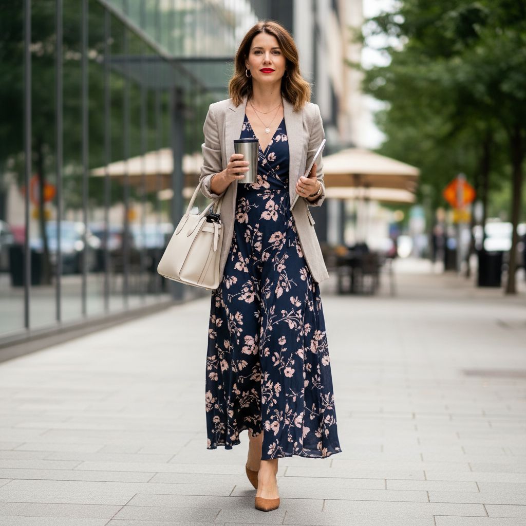
In fashion, line is the path your eye follows on a garment. Sometimes it’s obvious (a stripe). Sometimes it’s subtle (a seam, fold, or row of topstitch).
Lines do three big jobs:
- Guide the eye (where people look first)
- Shape the silhouette (how the outfit “reads” from a distance)
- Set the mood (sharp, soft, calm, bold, sporty, formal)
=> But here’s the twist: Lines don’t “flatter” by magic. The result depends on contrast, spacing, fit, fabric, and placement. Let’s break it down the useful way.
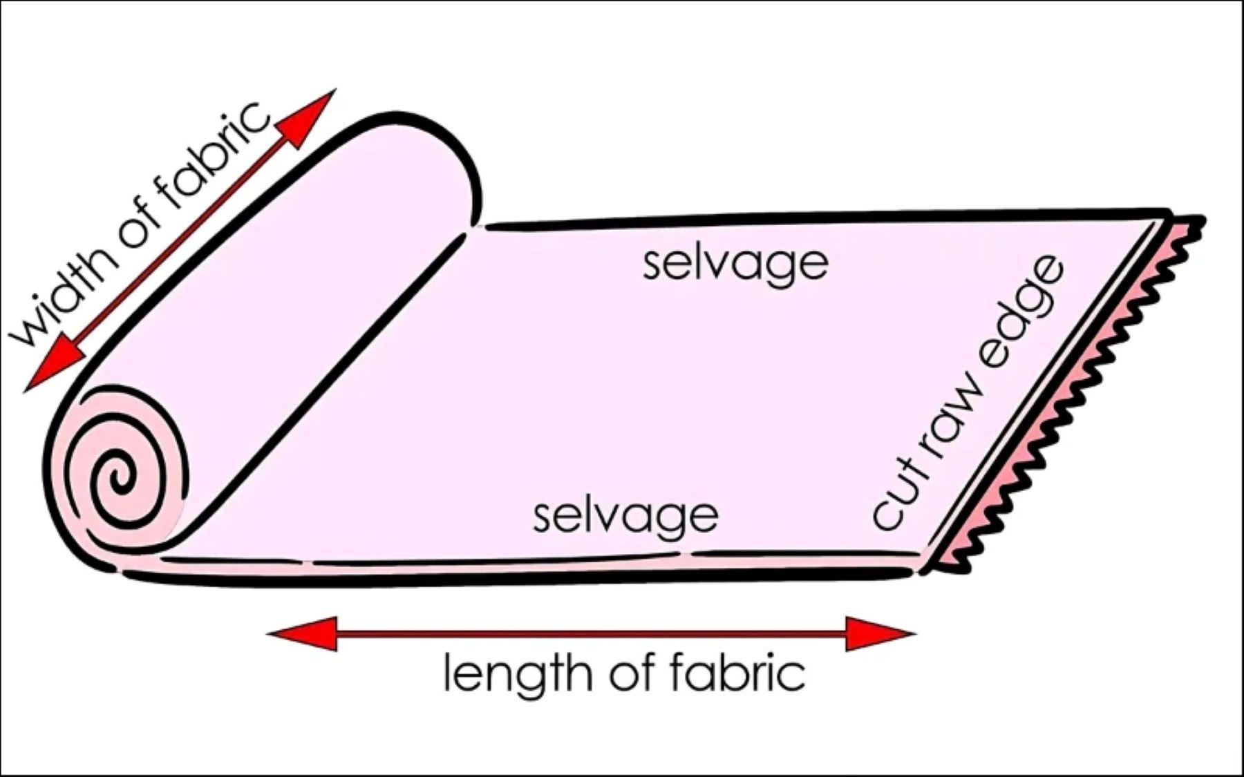
1) What Counts As a Line in Clothing?
A line can be visible or implied.
Visible lines
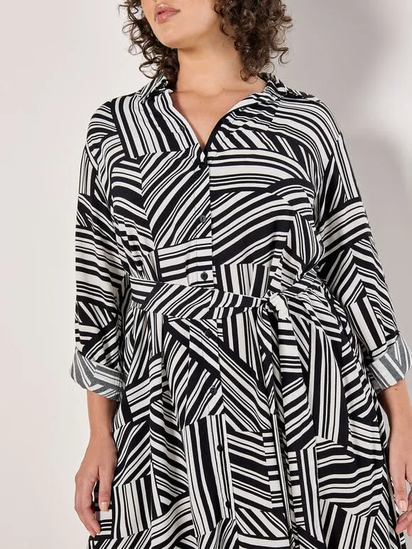
- Stripes and prints
- Piping and trims
- Contrast panels
- Topstitching
- Zippers, plackets, button rows
Implied lines
- Darts and shaping seams
- Pleats and folds
- Draping
- Hem angles
- Shoulder slope and armhole shape
Design tip: If you can trace it with your finger, it’s a line.
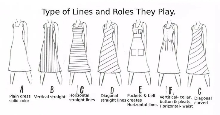
2) The Main Line Directions
Line direction is one of the fastest ways to control how a garment “reads” at first glance.
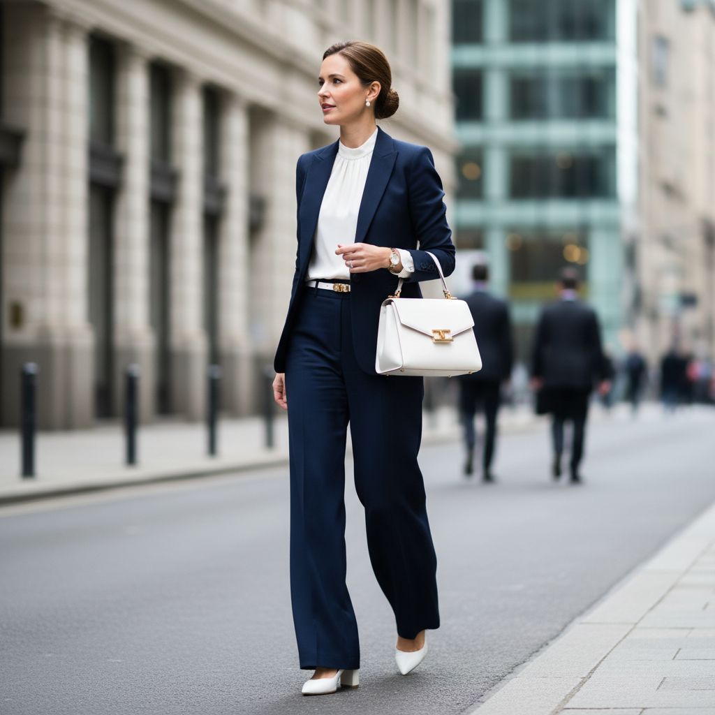
Vertical lines
- Vibe: Clean, calm, structured, formal.
- Common effect: Can feel “longer” and more streamlined.
- Examples: Princess seams on a blazer, Long coat panels, Center-front zipper.
Horizontal lines
- Vibe: Stable, grounded, classic, casual.
- Common effect: Can feel wider or more “balanced.”
- Examples: Chest stripe on a tee, Waist seam on a dress, Cuffs and hem bands.
Diagonal lines
- Vibe: Movement, energy, modern, sporty.
- Common effect: Adds motion and leads the eye across the body.
- Examples: Wrap dress overlap, Asymmetric zipper, Diagonal color blocking.
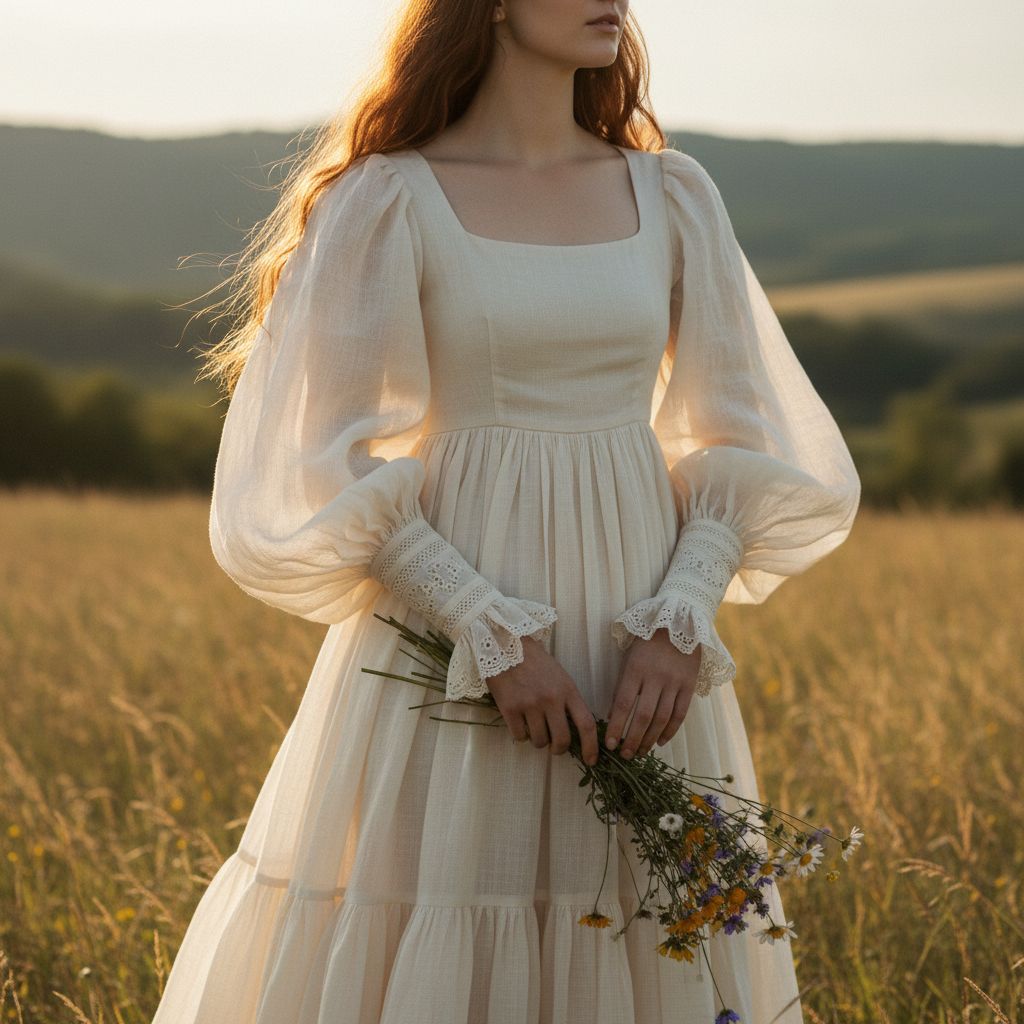
Curved lines
- Vibe: Soft, human, elegant, romantic.
- Common effect: Feels gentle and flowing.
- Examples: Scoop neckline, Curved princess seam, Draped panels.
3) The “Hidden Rules” of Line Design
- Thickness: Thin lines feel refined; thick lines feel bold and casual.
- Spacing: Wide spacing looks calm; tight spacing looks intense.
- Contrast: High contrast grabs attention fast; low contrast feels subtle and expensive.
- Placement: A line at the waist defines shape; a line at the shoulder builds presence.
- Continuity: Uninterrupted lines feel sleek; broken lines feel cluttered.
4) Line types designers use
How lines show up in pattern and construction:
- Seam lines: Side seams, princess seams (for shaping).
- Style lines: Color blocking, angled pockets (for brand identity).
- Stitching lines: Topstitch, quilting (for premium feel).
- Trim lines: Piping, reflective strips (for focus).
5) Simple Design Checklist
| Checklist question | What it’s testing | Quick fix |
|---|---|---|
| What is the main line? | Visual hierarchy | Pick 1 hero line, soften others. |
| Clear start + end? | Eye flow | Extend the line or frame it. |
| Contrast too loud? | Premium vs Shouty | Use tone-on-tone or thinner trim. |
| Support movement? | Wearability | Move seams away from stress zones. |
| Factory can sew it? | Manufacturability | Simplify curves, standardize specs. |
Conclusion
Line is the quiet “director” of a garment. The best designs use lines with a clear purpose: one strong path for the eye, supportive secondary lines, and nothing extra that creates noise. In production, cleaner lines mean better consistency and fewer defects.