A summer camp T-shirt is more than “matching shirts.” It’s a badge that says, “I was there.” The best camp tees get worn long after camp ends because they’re comfortable, look cool, and bring back memories. Most camp shirts fail because they’re designed like event uniforms, not like something people choose to wear. This guide shows you how to design a camp T-shirt that campers love, staff actually wear, and parents don’t complain about after one wash.

Start With One Clear Idea (Not 10)
Think about the camp shirts you’ve actually kept. They weren’t packed with details; they had one simple message. Before you pick fonts or colors, lock in one main idea: adventure, friendship, or growth. Ask yourself: What is this camp about? What’s the vibe? What memory should the shirt trigger later?
Pro tip: If you try to show everything (camp name, 6 icons, 3 slogans), the design turns into clutter. CONFIDENCE comes from simplicity.
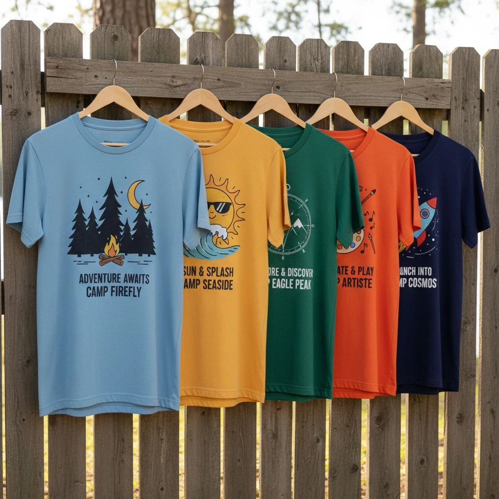
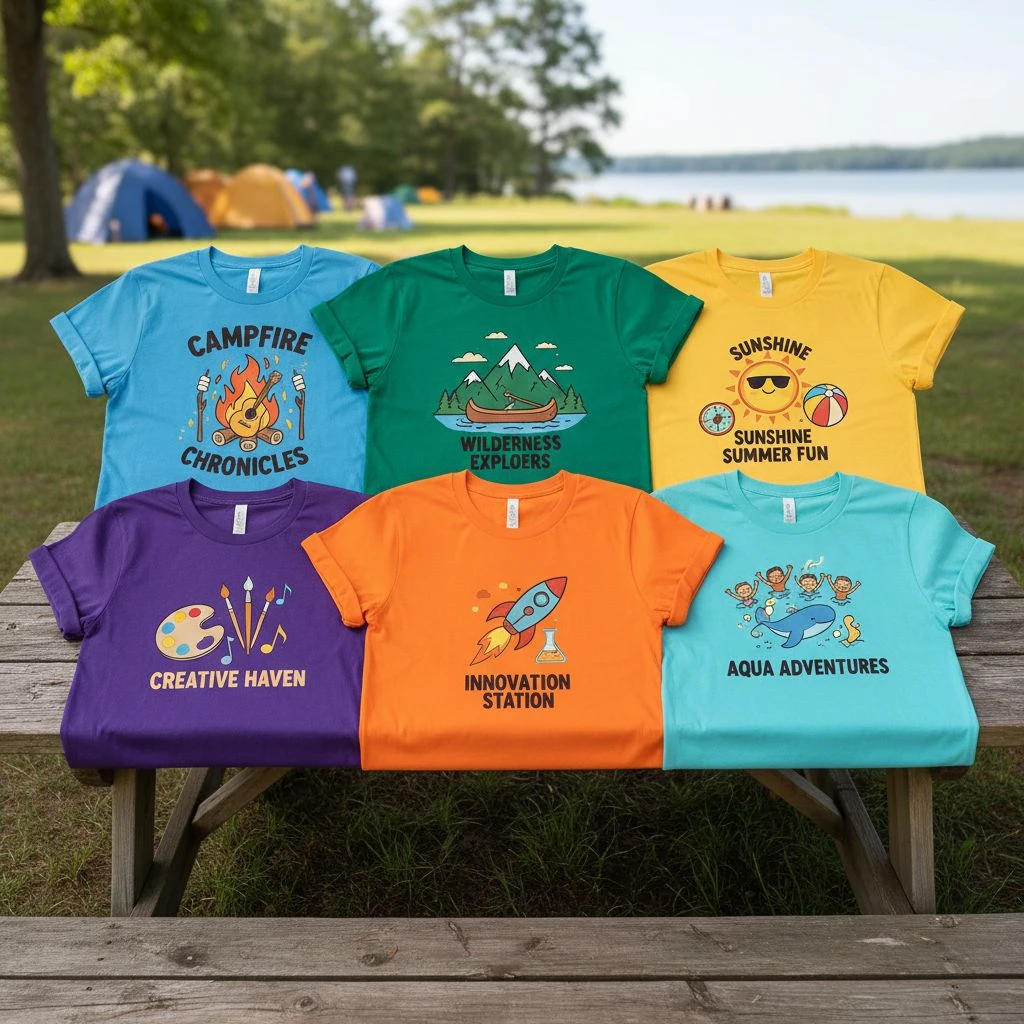
Choose a Visual Theme
A good camp theme is visual and simple. One icon or scene should tell the story at a glance. If it needs a paragraph to explain, it’s probably too complicated for a T-shirt.
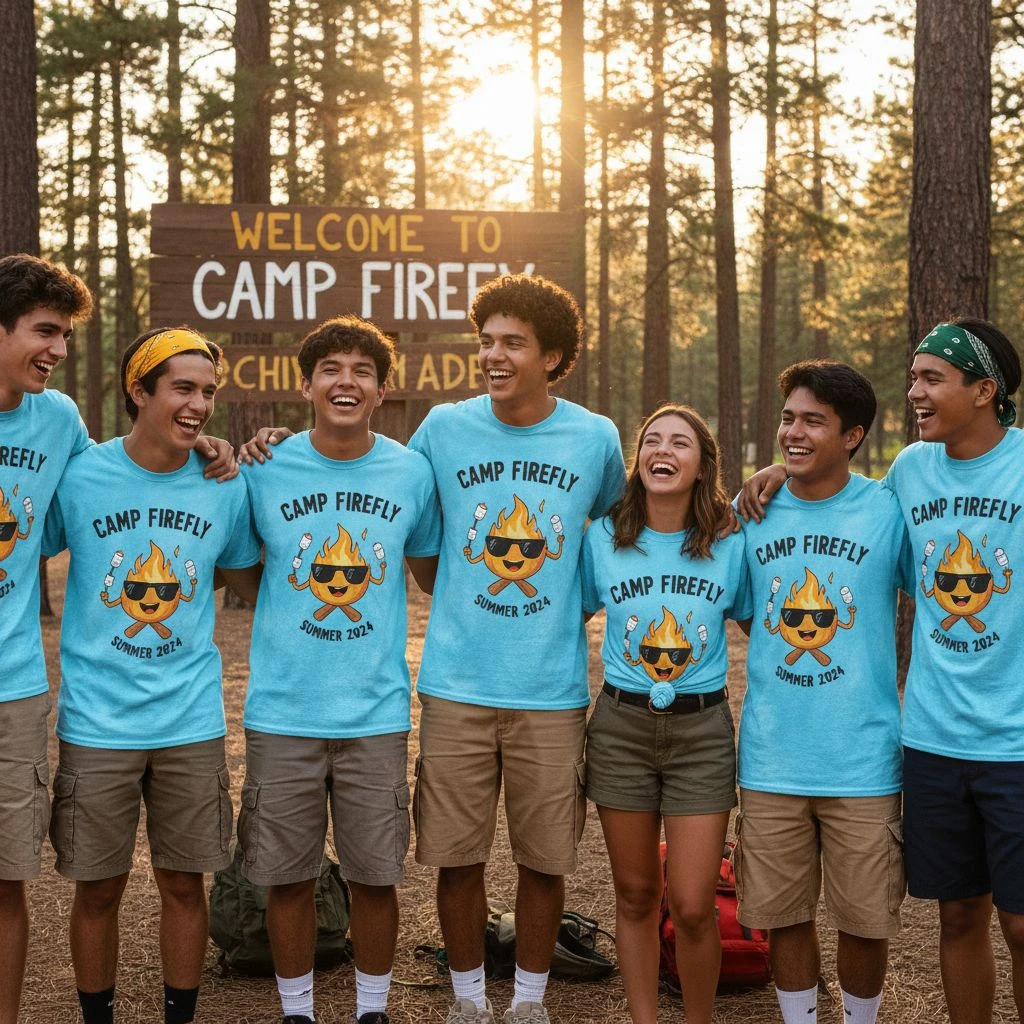
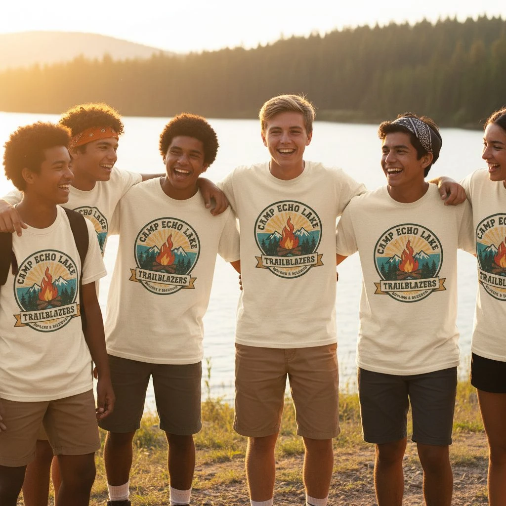
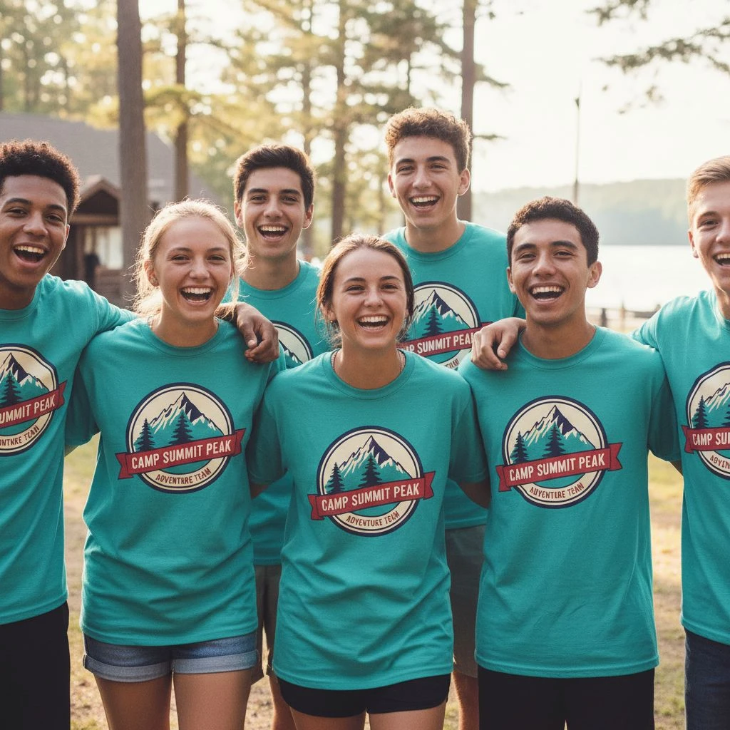
- Adventure: Mountains, compass, or campfire.
- Water/Beach: Waves, sun, or paddle icons.
- STEM: Rockets, circuits, or pixel icons.
- Leadership: Crests, shields, or “Class of” identity.
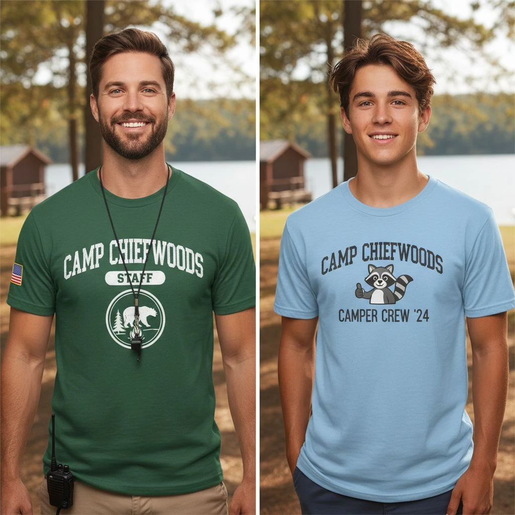
Build the Design Like a Brand, Not a committee
Campers want to wear these shirts at school, not just at camp. That means thinking like a clothing brand. The winning layout formula: A small front-left chest logo (clean and wearable) paired with a strong “main moment” graphic on the back.

Typography and Color Choices
Typography should match the vibe: rough serifs for nature camps, bold sans-serifs for sports. Rule of thumb: Use no more than 2 fonts and ensure it’s readable from 10 feet away. Avoid super thin fonts as they print poorly and fade faster.
For colors, choose high contrast strategies (light ink on dark shirts). Smart strategies: Use 2–3 ink colors maximum to keep it clean, durable, and cost-effective. Forest green, charcoal, and navy work best for outdoor camps.
Comfort: Pick a Shirt They Actually Like Wearing
If the shirt feels cheap, the design can’t save it. Fabric choices:
- 100% Cotton: Soft and breathable (can shrink).
- 60/40 Cotton-Poly Blend: Soft, durable, and less prone to shrinking—usually the best for camps.
- Midweight (5.5–6 oz): Holds shape better than ultra-lightweight options.

Printing and Logistics
Screen Printing is the best option for bulk camp orders due to its durability and cost-efficiency. For staff vs. camper shirts, use different colors or a subtle “STAFF” marking on the sleeve for quick identification.
Final Thoughts
The perfect summer camp T-shirt is the one campers choose to wear again. Focus on one clear theme, a wearable layout, and durable fabric. If each decision is intentional, the shirt becomes a lasting badge of belonging.
If you want a full concept, tell me: your camp type, age range, and budget level. I will draft 3 complete T-shirt concepts that fit your camp perfectly.