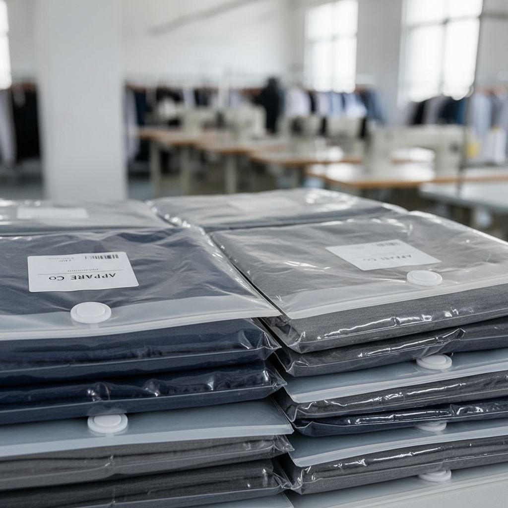
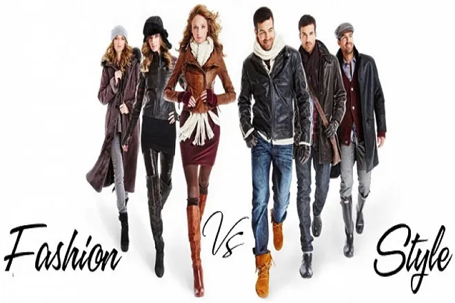
Creating stylish and functional clothing isn’t just about fabric and stitching. At Mekong Garment, we believe great fashion begins with a solid understanding of the elements of design. These are the visual tools that designers use to build structure, emotion, and identity into every garment. Let’s explore the 6 essential elements that shape every successful piece of fashion—and how we use them to bring your clothing to life.
Line – The Direction of Design
Line refers to the visible or suggested direction in a design. It could be created by seams, folds, trims, stripes, or stitching. Lines lead the viewer’s eye, define shapes, and influence how a garment fits or flatters the body.

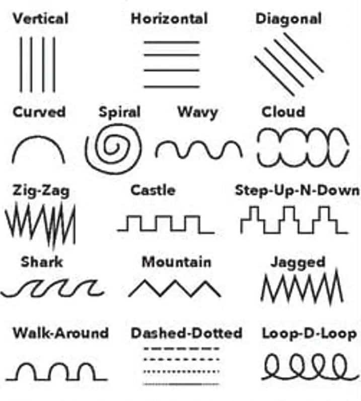
Types of Lines in Fashion:
Lines are more than just outlines—they direct the eye, shape the body, and set the mood of a garment. Understanding line types helps designers sculpt the silhouette and express different emotions.
- Vertical lines: Make the body appear taller and slimmer. Suggest elegance and formality.
- Horizontal lines: Add width and stability. Balance proportions.
- Diagonal lines: Suggest movement and dynamic energy. Great for sporty designs.
- Curved lines: Add softness and femininity, often found in flowing dresses.
Fashion Examples: Vertical lines in a long coat create a slimming effect; horizontal stripes on a sailor shirt give a balanced look.
Shape – The Silhouette of Style
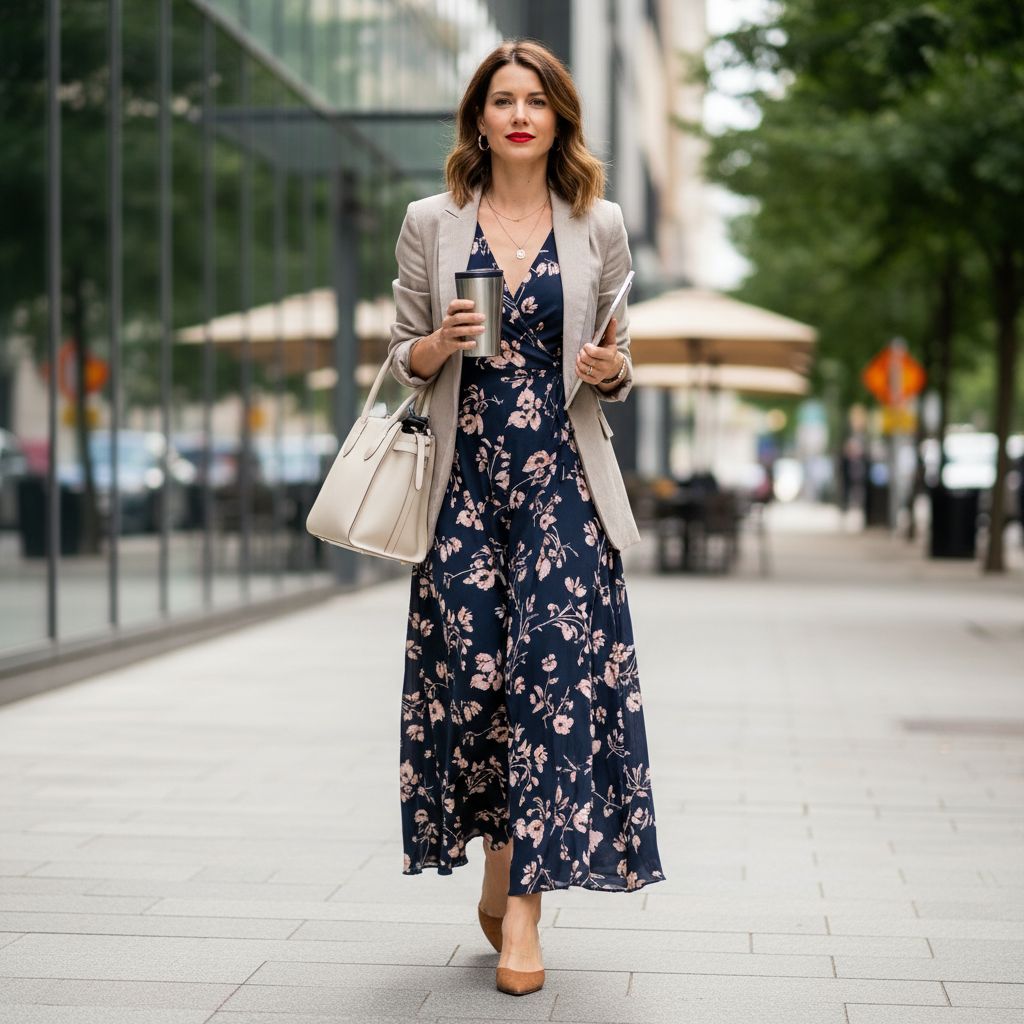
Shape refers to the overall outline of a garment (silhouette). It’s what people see first—A-line, hourglass, boxy, or fitted. Shape defines the general appearance from a distance.
Common Shapes:
- Natural: Follows the body’s contours.
- Bell: Fitted at the top, flared at the bottom.
- Tubular: Straight up and down, popular in minimalist pieces.

Form – The 3D Body of the Garment
Form is the three-dimensional structure. It considers how clothing wraps around the body, adds volume, and interacts with light and movement.
- Structured Form: Sharp, professional, holds its shape.
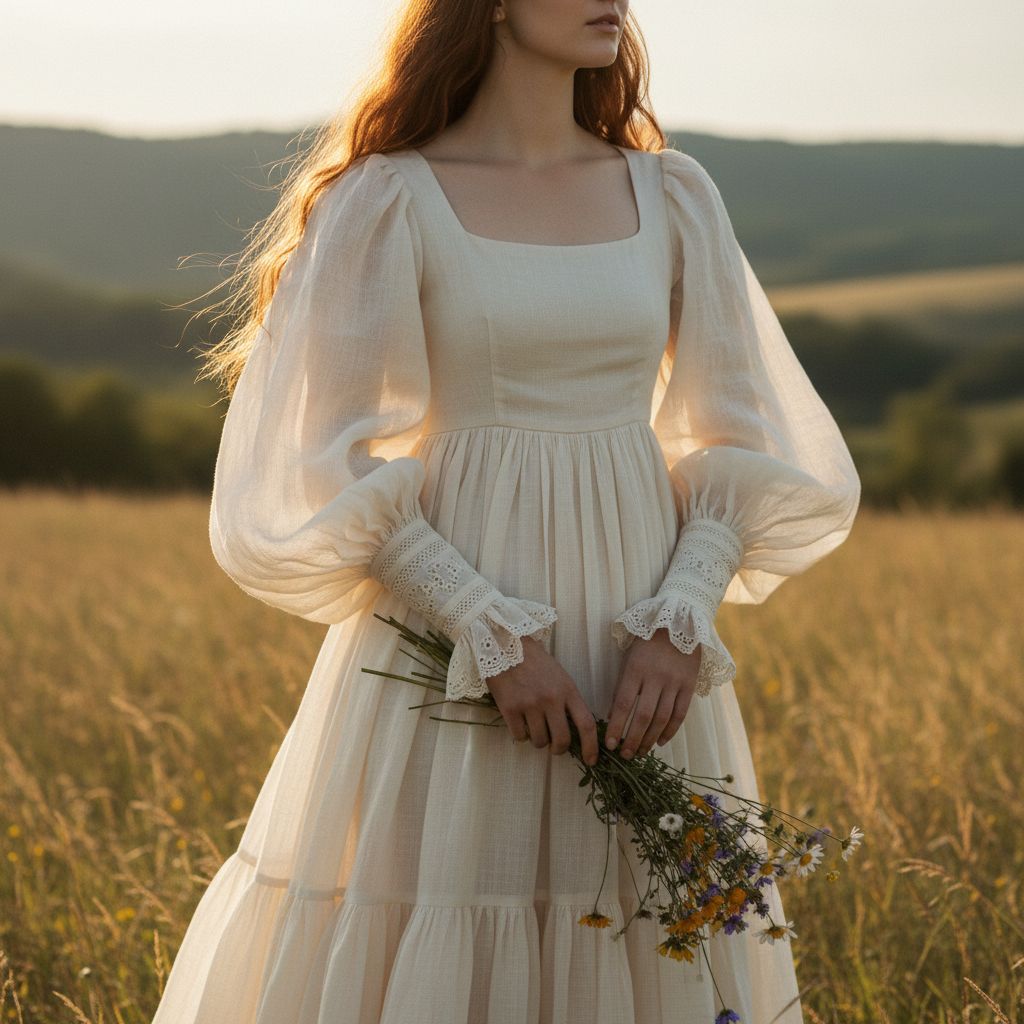
- Draped Form: Flows softly, elegant and comfortable.
- Voluminous Form: Oversized silhouettes, adds drama and visual interest.
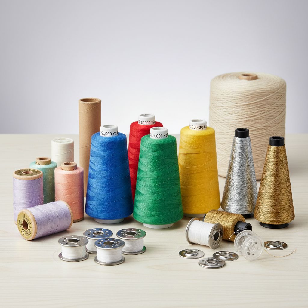
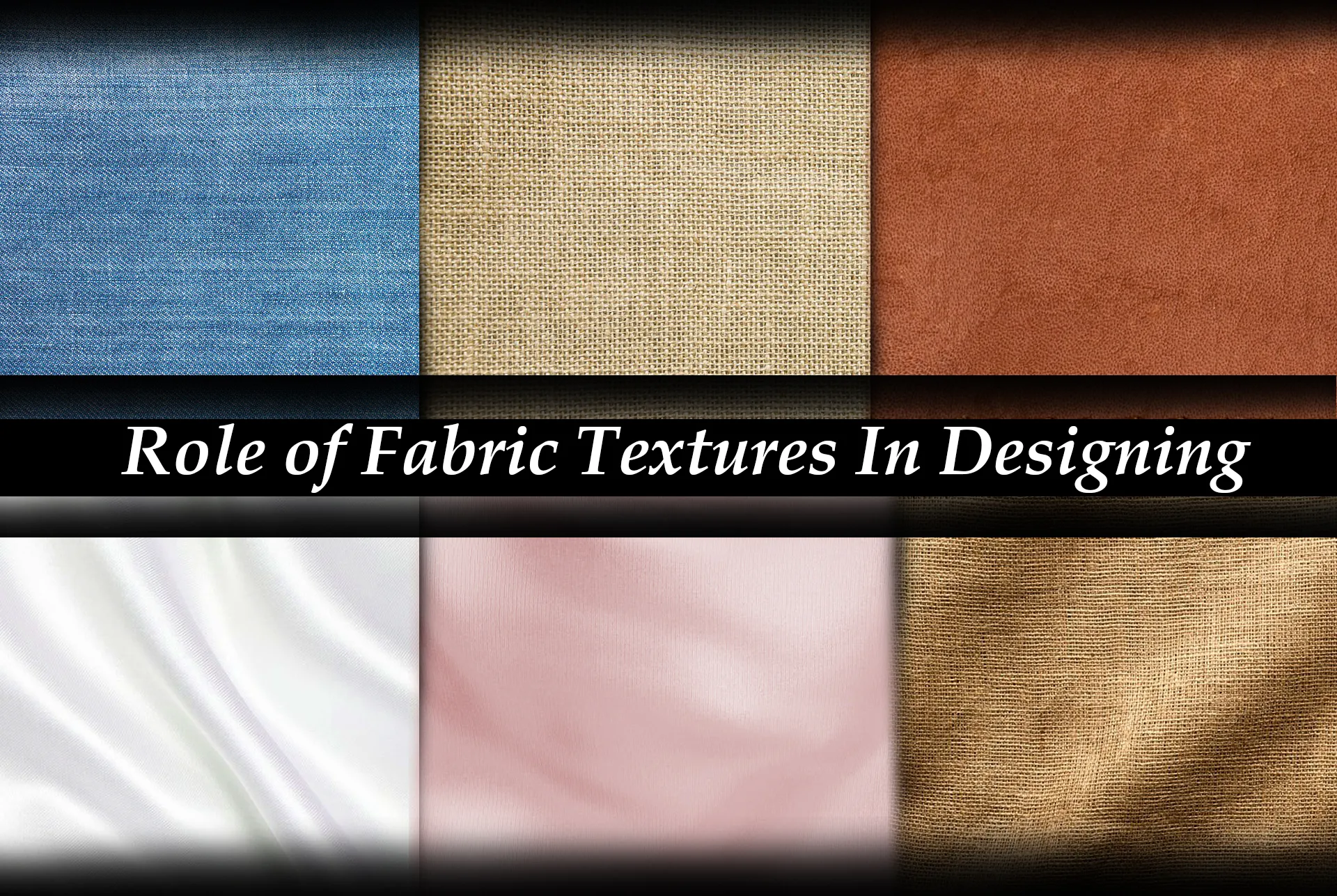
Texture – The Feel and Look of Fabric
Texture refers to how a fabric feels (soft, rough, stiff) and how it reflects light (shiny, matte). It adds depth and contrast to any design.
- Rough (Tweed): Rustic and traditional.
- Smooth (Silk/Satin): Luxury and elegance.
- Soft (Velvet): Warmth and comfort.
Space – The Balance of Full and Empty
Space is about the area within and around design elements. It creates visual balance.
- Positive space: The area occupied by fabric.
- Negative space: Blank areas (like cut-outs) that let the design breathe.
Color – The Mood Maker
Color is the most emotionally powerful element. It defines seasons, brand identity, and mood.
- Red: Power and boldness.
- White: Purity and minimalism.
- Black: Sophistication and strength.
Mekong Insight: We help clients choose colors that reflect company values and market trends, like earth tones for comfortwear.
FAQs About The Art of Style
What are the 6 elements of design in fashion?

The six elements are Line, Shape, Form, Texture, Space, and Color. You can think of them like the basic “tools” or “building blocks” of any garment. Designers mix these tools to control what people see first, where the eye moves, and how the clothes feel on the body. If you skip one element, the design often feels unbalanced, even if you cannot say why. Some people say fashion is only about taste, but these six elements are the hidden structure behind that “taste”.
Why do these elements matter for a fashion brand?
They matter because they change the first impression of the garment, the comfort for the wearer, and the feeling of “cheap” or “premium”. A T-shirt with good Shape and Form but bad Color and Texture may still look boring on the shelf. On the other hand, strong Color with bad Shape can sell once but get bad reviews for fit. If a brand ignores these elements, they usually see more returns, more complaints, and weaker repeat purchases. Many brands blame the factory for “bad samples”, when in fact the design brief did not control these elements clearly.
What is “Line” in clothing design?
Line is the path your eye follows when you look at a garment. It comes from seams, darts, yokes, panel cuts, stripes, pleats, piping, or even from the way fabric folds when worn. Vertical lines can make a person look taller or more slim. Horizontal lines can add width or give a sense of stability. Diagonal and curved lines add movement and softness. The danger is using too many random lines: if you add panel seams “for style” with no clear idea, you can make the body look chopped, heavy, or strange in photos.
What is the difference between Shape and Form?
Shape is the flat outline or silhouette that you see from a distance. For example: boxy tee, A-line dress, hourglass dress, straight-leg pants. It is like the shadow of the garment. Form is the three-dimensional body of the garment when it sits on a real person. It includes the puff of a sleeve, the way a coat stands away from the body, the volume of a skirt, and the drape over the shoulders and hips. Many teams mix these two ideas and then get confused. A sketch can show a nice Shape, but if the Form and fabric choice do not support it, the real sample will feel wrong, even if the pattern is “correct” on paper.
In Short, What is Texture?
Texture is how the fabric looks and feels to touch. It can be smooth, rough, soft, stiff, shiny, matte, fluffy, crisp, etc. Texture also affects how the fabric falls: a soft cotton jersey drapes close to the body, while a stiff twill may hold its shape. In photos and on social media, texture changes how “rich”, warm, or cheap a piece looks. Many brands choose fabric only by price and color, then wonder why the product looks flat or lifeless. If the texture does not match the mood of the design, the whole piece feels off, even if people cannot say exactly why.
In Short, What is “Space” in design?
Space is the balance between areas that are filled and areas that are left empty. Filled areas include things like prints, seams, pockets, graphics, trims, and visible structure. Empty areas are clean zones with no heavy detail; they let the eye rest. Good use of space helps the main detail, such as a logo or graphic, stand out clearly. If you put seams, print, logo, and text very close together, the garment feels noisy and cheap. But if you leave too much empty space with nothing to focus on, the product can look plain or unfinished. The trick is to decide what you want people to see first, then protect some space around that point.
Why is Color treated as a design element, not just a choice?
Color is a design element because it controls emotion and story in a very fast way. It also signals season (summer vs winter), use (sporty vs formal), and brand identity. When we talk about color, we do not look only at the basic hue (red, blue, green) but also at saturation (how strong or soft the color is), value (light or dark), and contrast with other colors around it. High contrast feels bold and loud; low contrast feels soft and calm. If you only say “make it blue”, you leave a lot of risk: the wrong saturation or value can make the piece feel cheap or off-brand. Some brands over-trust color trends and ignore the other five elements, and then the design ages very fast.
Is fashion only about personal taste, not about these elements?
Personal taste is important, but it is not the whole story. These elements shape how most people read a garment, even if they do not have design training. For example, a very heavy Shape on top of a very skinny bottom often feels unbalanced to many viewers. Or a busy print with zero empty Space is tiring to look at. So while one person may say “I like it” and another says “I don’t”, the design still follows basic visual rules. If a brand hides behind “it’s just my style” and never thinks about these elements, they may confuse customers and weaken trust in the brand.
Can I focus only on color and ignore the other elements?
You can try, but it is usually a short-term move. A strong color or trendy shade can attract attention and sell the first batch. But if the Shape is awkward, the Form feels uncomfortable, or the Texture is wrong for the climate, people will not wear the garment often, and they may not buy from you again. Color can help a good design, but it cannot rescue a weak structure. Some fast-fashion items do this on purpose: they rely on bright Color and print, but they do not invest in better Shape, Form, and Texture. That model can work short-term, but it is not a good strategy for a brand that wants long-term trust.
Do these elements also matter for simple basics like T-shirts and uniforms?
Yes, they may even matter more for basics. Because basics look simple, every detail of line, shape, form, texture, space, and color becomes easier to notice. A basic tee with a slightly better Shape and a softer Texture feels much more premium than a cheap tee, even if the pattern difference is small. For uniforms, the wrong Form or Texture can cause discomfort for people who wear the garment many hours per day. Some brands think “it is just a basic”, so they only focus on price and color. But the brands that win in basics usually manage these elements better than others.
How can I use the 6 elements in a design brief or tech pack?
You can turn each element into one or two short lines in your brief. For example: Line: “Clean vertical seams only, no extra style lines.” Shape: “Relaxed, boxy silhouette for casual wear.” Form: “Soft drape, no shoulder pads, nothing very stiff.” Texture: “Smooth handfeel, mid-weight, not shiny.” Space: “Leave chest area mostly clean; logo must have empty space around it.” Color: “Deep navy body with high-contrast white logo.” This may look simple, but it cuts a lot of guessing between designer, merchandiser, and factory. If you skip these notes, each party will imagine a different garment in their head and the sample will likely miss your original vision.
How can I quickly check if a design uses these elements well?
A fast method is to take a photo of the sample, then zoom out so the garment looks small on the screen. Ask yourself: Is the silhouette clear and strong, or does it feel confused? Does anything look too crowded or too empty? Do the lines lead the eye in a nice way, or do they cut the body in strange places? Does the texture match the mood and season? Does the color contrast help the main detail, like the logo or print, or fight against it? This “zoom out test” sounds simple, but it forces you to see the design like a customer seeing it on a shelf, not like a designer staring at the garment up close. If you cannot give quick, confident answers, the design probably needs changes in one or more of the six elements.