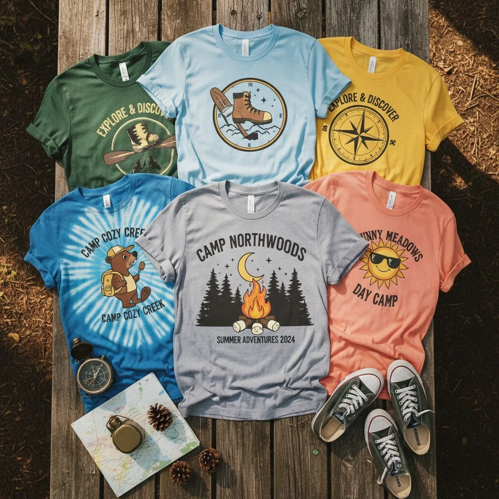
Custom T-shirts can do a lot: promote a brand, unify a team, raise funds, or make an event feel “real.” But here’s the hard truth, most bad shirt orders don’t fail because the idea was bad. They fail because the design wasn’t built for fabric and printing. If you want shirts people actually wear (not ones that live in drawers), avoid these 15 mistakes.
Top Custom T- Shirts Design Mistakes You Need to Avoid
Designing Without a Clear Goal (You’re Designing “For Everyone”)
Before you pick colors, fonts, or a cool graphic, you need one thing: a clear goal. Because the moment you try to design “for everyone,” the design usually ends up feeling like it’s for no one. It becomes a mix of ideas that don’t match, and the shirt looks fine… but not memorable. A good custom T-shirt should do one main job, like promote your brand, celebrate an event, or build team spirit. When that job is clear, every design choice gets easier: what to say, what to show, and what to leave out. Without that focus, you’re basically guessing—and guessing is how you end up with a shirt people don’t really want to wear.
If you can’t answer who the shirt is for and what it should achieve, the design turns into a random mix of fonts and clipart. Avoid it by deciding:
- Who wears it? (customers, staff, students, fans, family)
- When do they wear it? (daily, event-only, gifts)
- What’s the single message? (brand, slogan, identity, inside joke)
=> Notes: A shirt with one strong point beats a shirt with ten weak ones.
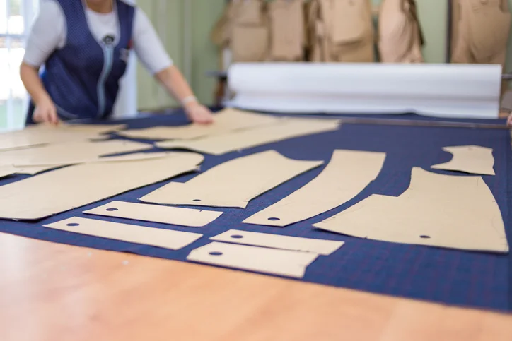
Choosing the Wrong Shirt Fabric for the Design
A lot of people think the “design” is only the graphic. But on a T-shirt, the fabric is part of the design, too. The same print can look clean and premium on one shirt… and look cheap, rough, or distorted on another. That’s because fabric changes how ink sits, how colors show up, and how the shirt feels when someone wears it. If the fabric is too thin, too stiff, too hot, or it shrinks after washing, people won’t reach for it no matter how cool the artwork is. So before you lock the design, make sure the shirt material matches the purpose: everyday wear, event giveaways, work uniforms, or brand merch. The right fabric doesn’t just support the design, it makes the whole shirt feel “worth it.”

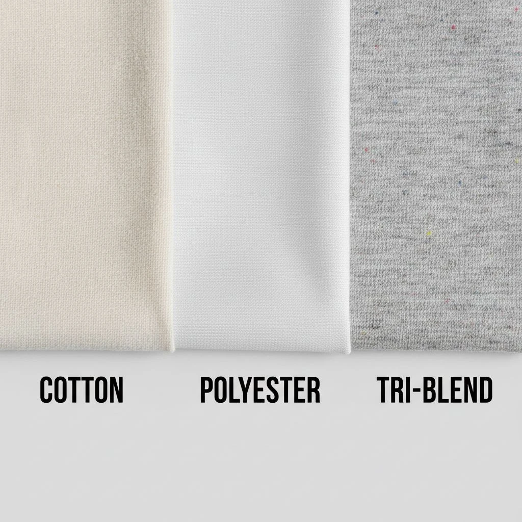
A “perfect design” can still look cheap if the shirt itself feels rough, too thin, too hot, or shrinks. Common mismatch examples:
- Super detailed print on a cheap, uneven surface → looks messy
- Heavy ink on a very thin shirt → shows through, feels stiff
- Tight-fit fashion design on boxy promo blanks → wrong vibe
Fix: Pick fabric and fit based on use:
- Events/cheap giveaways → durable budget blends
- Brand merch → softer cotton, better stitching
- Workwear → stable fabric, less shrink, strong seams
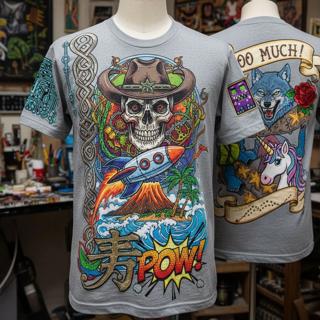
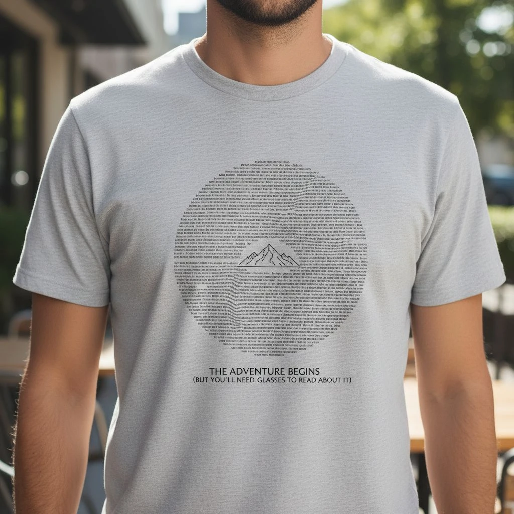
Using Low-Resolution Artwork (Looks Great on Screen, Bad on Shirt)
This mistake is sneaky because it usually looks totally fine on your phone or laptop. But once it’s printed big on fabric, low-quality artwork shows its true face, blurry edges, jagged lines, and fuzzy logos that instantly make the shirt look cheap. Here’s the problem: screens can “hide” flaws because they’re small, bright, and sharp. Printing does the opposite, it magnifies everything. So if your design is a screenshot, a tiny PNG pulled from Google, or a logo that got stretched larger, the print won’t look clean no matter how good the shirt is. If you want a professional result, your artwork has to be print-ready, not just “looks okay on screen.”
This is the #1 production mistake. If you use a tiny PNG, screenshot, or stretched logo, the print becomes:
- blurry
- jagged
- pixelated
Fix:
- Use vector files when possible (AI, EPS, SVG, PDF)
- If raster: make it high quality and sized correctly (don’t “scale up later”)

Making Text Too Small (Or Too Fancy to Read)
On a screen, you can zoom in and read anything. On a T-shirt, people can’t. They see the design from a distance, while you’re moving, under different lighting, and on fabric that naturally has texture. That’s why tiny text or fancy fonts often fail even if they look “cool” in the design file. When text is too small, too thin, or too decorative, it becomes a blur. And once it’s unreadable, the message is basically gone. A shirt should communicate fast: one glance, one clear idea. If someone has to walk up close to decode your words, the design isn’t doing its job. So the goal isn’t to make text “pretty.” The goal is to make it instantly readable and wearable.

A shirt is not a poster. People see it from a distance, while you’re moving. Common text fails:
- Thin fonts on dark shirts
- Script fonts with tight spacing
- Long sentences in tiny size
- Busy fonts that “vibrate” on fabric texture
Fix:
- Use fewer words
- Increase font weight
- Keep clean spacing
- Test readability from 2–3 meters away
Ignoring Contrast (Design Disappears on the Shirt Color)
This is one of the most painful mistakes because the design can be good… and still look like nothing on the shirt. If your ink color is too close to the fabric color, the print doesn’t “pop”, it fades into the background and people won’t even notice it. On a bright screen, colors look stronger than they do in real life. But on fabric (especially heather, washed tones, or darker shirts), colors often appear duller, and fine details can get lost fast. That’s how you end up with a shirt that feels “empty,” even though you paid for printing. A simple rule: if the design can’t be seen clearly from a few steps away, it’s not a design problem, it’s a contrast problem.
A design can be “nice” and still be invisible. Classic mistakes:
- light gray on white
- navy on black
- pastel on heather (washed out)
- dark ink on dark fabric with no outline
Fix: Do a quick contrast check:
- View the design on the real shirt color
- Zoom out until it’s tiny, if it vanishes, it won’t work
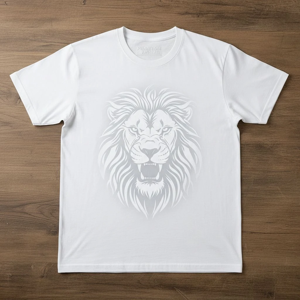
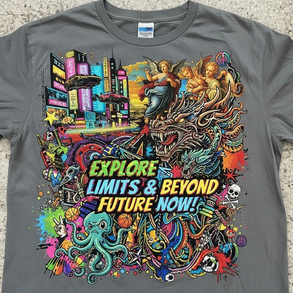
Overcomplicating the Design (Too Many Elements Fighting)
It’s tempting to add “just one more thing” a second font, an extra icon, a slogan, a badge, a pattern… and suddenly the shirt turns into a busy collage. On a screen, that might still feel exciting. On a T-shirt, it usually looks messy, confusing, and less wearable. The problem is simple: when too many elements compete for attention, nothing becomes the main focus. Your eyes don’t know where to look, and the message doesn’t land. Instead of feeling premium, the design can start to feel like a cheap flyer. A strong shirt design isn’t loud in every corner. It’s confident, clear, and gives the main idea room to breathe.
More elements don’t make it more “premium.” They often make it look cheaper. – Signs you’re overdoing it:
- 3+ font styles
- too many icons
- too many colors
- everything is the same “loud” size
- no empty space to breathe
Fix: Choose one hero element:
- a strong logo
- one illustration
- one phrase Then support it with 1–2 small elements max.
Not Designing for the Decoration Method

A design isn’t “ready” just because it looks good on your screen. It has to look good in the real world, after it’s printed, stitched, washed, and worn. And that depends a lot on the decoration method you choose: screen printing, DTG, DTF, embroidery, puff ink, and more. Here’s the catch: each method has rules. Some handle tiny details well, some don’t. Some love gradients, some hate them. Some feel soft, others feel thick. If you design first and pick the method later, you might discover your artwork can’t be produced the way you imagined or it comes out looking different and disappointing. So think of the printing method like the “language” your design must speak. If you don’t design in that language, the message gets lost in translation.
Screen print, DTG, DTF, embroidery, each behaves differently. – Example mismatches:
- tiny details + thick embroidery = details disappear
- gradients + basic screen print = banding or rough transitions
- very large solid ink areas = heavy feel, cracking risk over time
Fix: Decide the method early, then design for it:
- Screen print → bold shapes, limited colors, strong contrast
- DTG/DTF → more detail and gradients (still needs clean files)
- Embroidery → thicker lines, simpler shapes, larger text
Placing the Design in the Wrong Spot (Or Wrong Size)
Even a great graphic can look “off” if it’s placed badly. Too high and it feels like it’s choking the collar. Too low and it drifts toward the stomach. Too wide and it wraps into the armpits. And if it’s the wrong size, the shirt can look either awkwardly loud… or weirdly empty. Here’s the tricky part: placement doesn’t happen on a flat screen, it happens on a real body with curves, movement, and different sizes. What looks centered in a mockup might shift when someone wears it. That’s why sizing and placement should be treated like part of the design, not an afterthought. A simple truth: people judge a shirt in one second. If the print sits wrong, they feel it instantly, even if they can’t explain why.
“Center chest” is not always correct – Common placement problems:
- print too high (hits collar)
- print too low (hits stomach)
- design too wide (wraps into armpits)
- sleeve print placed where it disappears when arms relax
=> Fix: Use real placement guides and a visual mockup. Also: a small premium chest logo often looks more wearable than a giant billboard print.

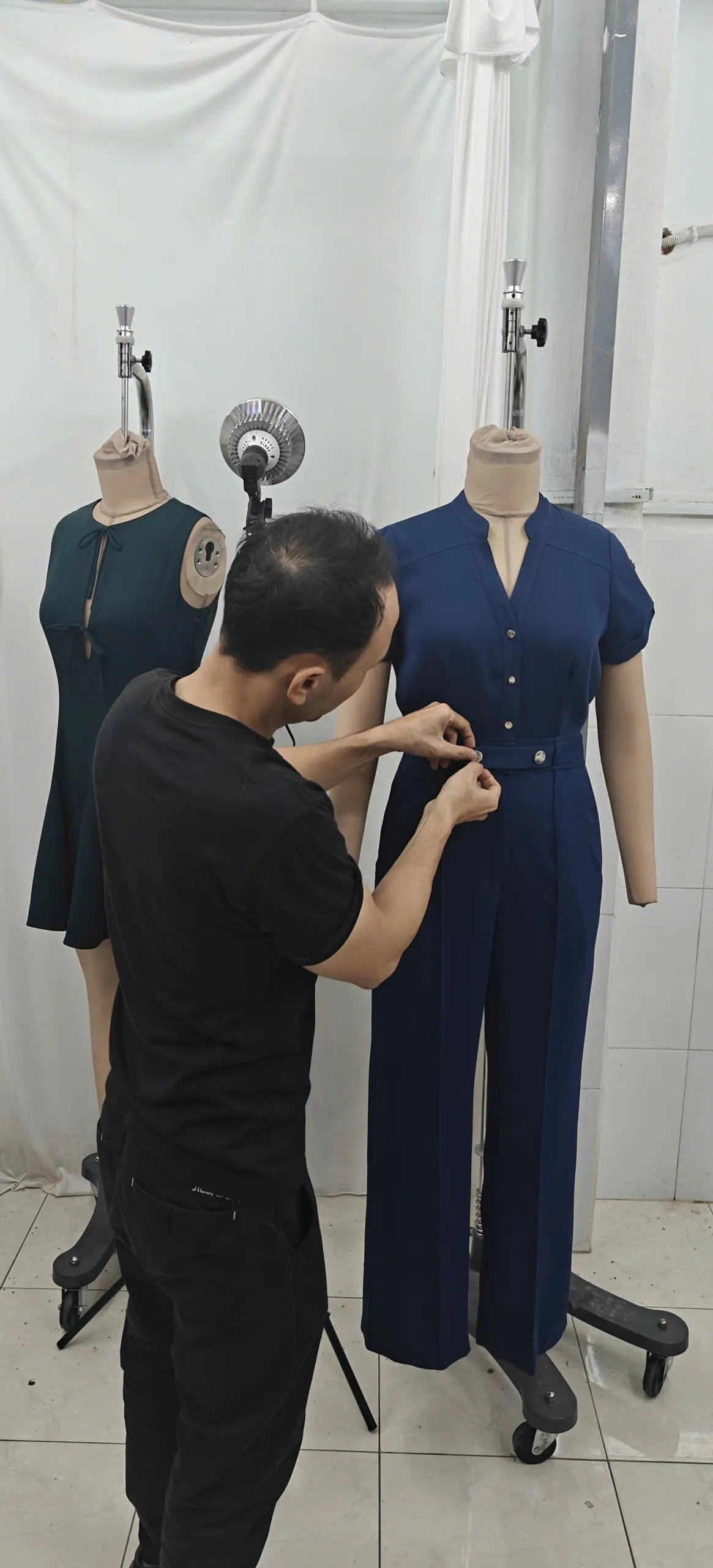
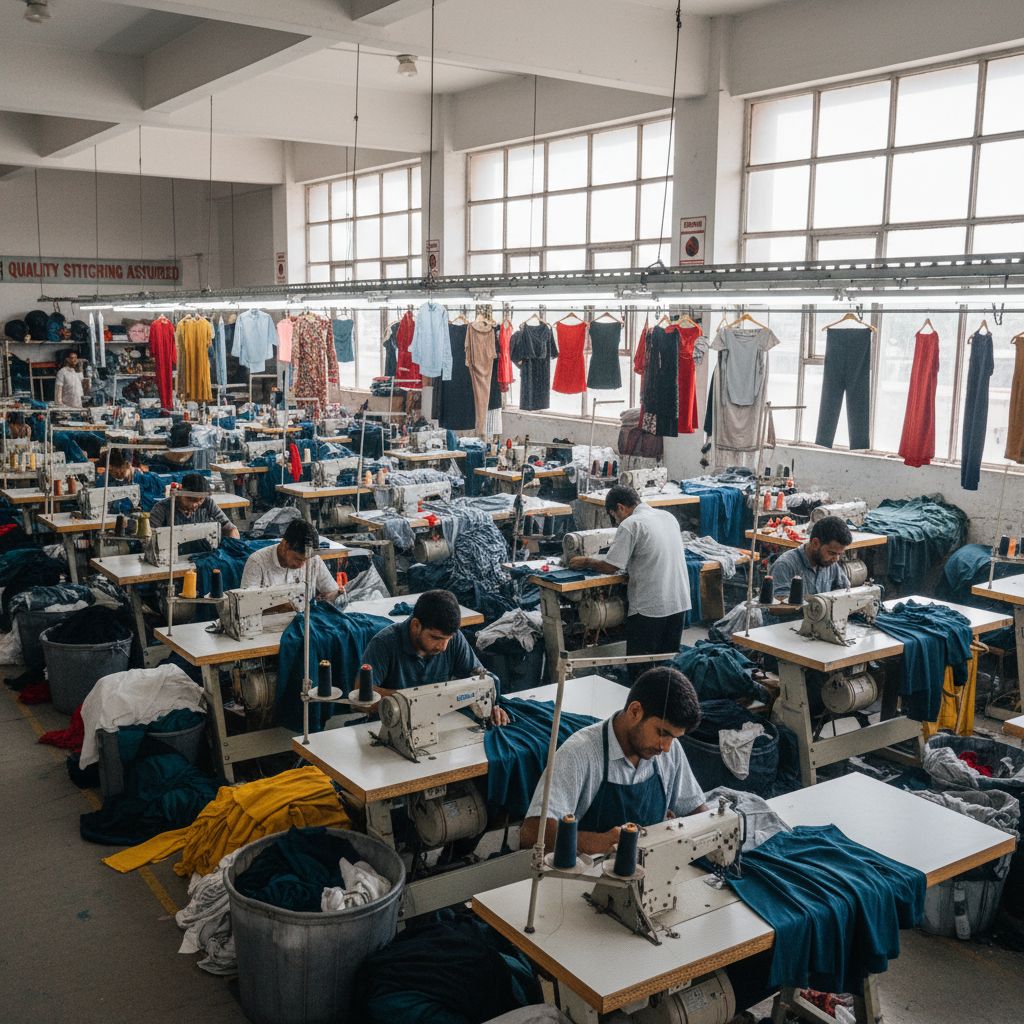
Ordering Bulk Without Sampling (The Most Expensive Shortcut)

Ordering a big batch without a sample feels like saving time… until it costs you the most money. Because once hundreds of shirts arrive, there’s no “undo.” If the fabric feels cheap, the fit is off, the colors look different, or the print sits in the wrong spot, you’re stuck with a pile of shirts people don’t want to wear. Screens and mockups can’t tell you everything. A sample does. It shows the real texture, the real ink feel, the real sizing, and how the design behaves on an actual shirt. Skipping that step is basically gambling especially when the order is for a team, a brand launch, or an event deadline. If you only make one “slow” decision in the whole process, make it this one: sample first, then scale.
Skipping samples is like ordering 200 pairs of shoes without trying a size. – What samples reveal:
- fit issues (tight neck, too short, too boxy)
- color differences (screen vs real)
- ink feel (soft vs heavy)
- print sharpness and alignment
Fix: Always test one of these:
- blank sample (for fabric + fit)
- printed sample (for final look)
- size set sample (if team order)
Not Planning Sizes and Fit (People Won’t Wear It)
You can have the best design in the world, but if the shirt fits badly, people won’t wear it. Simple as that. Fit decides comfort, confidence, and whether your “brand shirt” becomes a favorite… or a free cleaning rag. This mistake usually happens when people assume: “Unisex fits everyone” or “We’ll just guess the sizes.” But bodies vary a lot, and so do shirt cuts between brands. A Medium in one blank can feel like a Small in another. Add shrinkage after washing, and the problem gets worse. If you want your custom shirts to actually get worn, treat sizing like part of the design: plan it, offer options, and use a size chart. Otherwise, you’re printing for the drawer, not for real life.
Even a great print won’t save a shirt that fits badly. – Common sizing mistakes:
- assuming “unisex fits everyone”
- not accounting for shrink
- no women’s cuts or oversized options (when needed)
- ignoring local size preferences (Asia sizing vs US sizing)
Fix:
- offer a simple size chart
- collect sizes early
- consider 2 fits when possible (standard + women’s/oversized)
Not Checking Color Count (Costs Blow Up Fast)
More colors usually means higher cost (especially in screen printing). A design that looks “simple” on screen can secretly use lots of colors because of gradients and shadows.
Common fails:
- 8–12 colors hidden in a gradient
- “Black” that isn’t true black (rich black vs RGB black confusion)
- Tiny color details that add cost but don’t add value
Avoid it by:
- Deciding your max color count early (ex: 1–3 colors)
- Using flat colors instead of heavy gradients (if screen printing)
- Asking your printer what color limits make sense for your budget

Using the Wrong File Type (Printer Has to Rebuild It)
You send a screenshot PNG, the printer asks for vector, and suddenly your timeline and cost increase.
Common fails:
- Sending JPG with a background (can’t separate cleanly)
- Sending low-res PNG and hoping it prints sharp
- Sending Canva export without proper settings
Avoid it by:
- Using vector files when possible (AI/EPS/SVG/PDF)
- If raster: export at high quality and correct size
- Keeping transparent background versions ready


Forgetting Transparent Backgrounds (Your Design Gets a “White Box”)
This is a classic: your logo looks clean on white artboard, then prints with a visible rectangle around it.
Common fails:
- JPG logos placed on dark shirts
- PNG exported without transparency
- “White background” blends on mockups, shows in real print
Avoid it by:
- Exporting PNG with transparency (or vector)
- Checking your file on a colored background before sending
- Asking printer to confirm no background layer exists
Putting Important Details Where Folds Happen
Fabric folds. Seams exist. If you place key elements over high-movement or seam areas, the design can warp visually.
Common fails:
- Text too close to armpits → bends and distorts
- Large print across side seams → looks split
- Long text on elly area → creases hide words

Avoid it by:
- Keeping key elements centered in safe zones
- Avoiding seams/armpits for critical text
- Testing placement on a real shirt template
Skipping Real-Life Lighting Tests (Colors Look Different Outdoors)
Colors shift under indoor lighting vs daylight. A “perfect” tone on screen can look weird in real use.
Common fails:
- Reds look too orange
- Blacks look washed on heather
- Neon colors look harsh outdoors
Avoid it by:
- Checking sample under daylight + indoor light
- Using Pantone (when applicable) for color control
- Avoiding ultra-subtle color differences that won’t print consistently
Final Thoughts / Conclusion
A custom T-shirt is only “successful” when people want to wear it again and again. That’s the real test, not how good it looks on your screen, but how it looks on a real body, under real light, after real washes. If you remember just one thing, make it this: a great shirt is a balance.
- Design that’s clear and easy to read
- Fabric + fit that feels good, so people don’t avoid it
- Printing method that matches the artwork, so it stays sharp and durable
And here’s a little devil’s advocate: many brands obsess over the graphic… then ruin it with the wrong blank, a rushed proof, or a file that isn’t print-ready. That’s how “good ideas” turn into shirts nobody wears. So before you order in bulk, slow down for two quick steps:
- Test a sample (blank + printed if possible)
- Check the basics (size, placement, contrast, file quality)
Do that, and your custom T-shirts won’t just look professional—they’ll feel professional. And that’s what makes them worth printing in the first place.